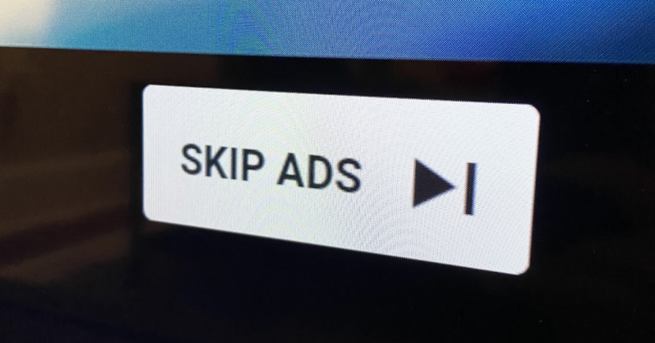
YouTube is reportedly testing a “redesigned” ad skip button, which is smaller in size, making it difficult for users to spot and click on it
Hate YouTube video ads? Well, brace up since you are about to hate them a lot more after a slick little update that YouTube might soon release.
YouTube has confirmed that it is currently working on a skip ads button ‘redesign’, which will make the skip button even smaller. Apart from being smaller, the skip ads button will have smaller text, have no capital letters in the word ‘Ads’ and will be more transparent, making it harder to spot and ultimately making users watch advertisements for a longer time, increasing YouTube’s ad earnings.
Here’s an example of what the skip ads button might look like, small enough?
“We’re testing an update to the design of the ‘Skip Ads’ button across all platforms. Our goal is to provide a more consistent user experience in line with the updated look and feel on YouTube we announced last year,” said YouTube in its statement about the ‘improved’ Skip Ads button.
Termed as an ‘improved’ skip ads button, it will definitely prove to be a success for YouTube, boosting the platform’s ad view rates, reach, and conversions, increasing the overall revenue on the platform and making advertisers a lot more interested.
“Spotted this really small ‘Skip ads’ button, seems like Google is testing this new button. It has a new format and is way smaller than the normal ‘skip’ box. If this gets rolled out, it will affect the view rate and the spend of the campaigns,” said Google Ads expert Thomas Eccel.
While Google is most-definitely testing the smaller skip ads button, we cannot be certain that the feature will roll out to the public soon, but when it does, it will surely spark a reaction.
Read more:


