What happened at Apple Keynote: WWDC 2014

“It’s the little things that matter” would probably be the one sentence the describes Apple’s event from the morning of the 2nd. Speaking in broad strokes, the event was divided in three major categories with Craig Federighi presenting each of them with the mesmerizing brilliance and showmanship that has been a constant reminder of the Jobs era.
OS X: Yosemite
 As Federighi started the show, he warmed up the audience to Apple’s more humorous side by joking about OS Oxnard and OS Weed as Apple went through it’s traditional naming crisis but finally the interactive map settled down to a point right around the center of California – the beautiful Yosemite (pronounced yo-seh-me-tee) National Park. The name wasn’t all that was beautiful at this massive OS unveiling though, Apple has completely radicalized their UI from the ground up with translucent sidebars that adjust to menu scrolls and changes to the background in a fluid (very iOS 7-like) and yet that doesn’t even come close the largest changes apple has brought the most extravagant of which are detailed below.
Spotlight: The new spotlight bar appears from nothing right in the center of your Mac’s display and does not only contain the ability to search your drive and it’s contents, but also the contents of the Web, the contents within your applications, locations on the revamped Apple Maps software, Yelp reviews, contacts cards, Calendar events and so much more.
Safari: In their ever-enduring effort towards simplicity, Apple has eliminated all interfaces from the Safari browser with the exception of one single solid bar at the top. The single search box functions as both an interactive menu for your favorites and your bookmarks, as a meta-search for the online engines of your choice (Google, Yahoo, Bing), and as a conventional URL bar. They’ve also added a symbolic one-click share button including your most recent email recipients along with the traditional list of networks and social media options.
Mail: Apple has addressed a fundamental flaw with it’s OS X Mail platform – it simply didn’t work; well, now it does. With the addition of what Apple calls Markup, you can now annotate (throw text boxes and arrows) right on the images you may have attached to your emails and you can even use your track-pad to sign PDF documents so you no longer have to endure the hassle of printing, signing and the re-scanning. Another massive innovation that simply blew away the minds of all in attendance was a Mail-iCloud collaboration that would allow email attachments sent through the iCloud Drive to extend to 5 Gigabytes in size!
iCloud Drive: In their conventional, conniving sense; Apple has brought to us iCloud Drive which is essentially a sleeker version of the Dropbox we all know and love. They’ve added the ability to store your iCloud files right on a folder in your computer and then access that folder in various apps and websites on all your Apple devices. Convenient? Yes. Innovative? Not so much.
iOS 8:
 After the grounds-up revamp from last year, iOS 8 (or at least it’s consumer aspect) does not nearly strike you to be as revolutionary. That, however, does not mean that this new edition does not come with it’s own fair share of essential and sometimes strikingly brilliant share of changes.
Messages: Beginning with one of the most noticeably absent features in all past versions of iOS, iMessage now supports one-touch Audio, Video and Image messaging. Alongside these, in an interesting take on the WhatsApp concept, there is also a Details pane where you can add or remove contacts from a group messaging string and access a combined stream of all media shared within the thread. In Apple’s own way, they’ve gone beyond the concept that innovated them allowing you to listen to voice iMessages simply by raising your iPhone to your ear and by replying to them through the same audio medium simply by taking back.
Notifications: As an extension of the previous section, a significant Notifications revamp allows you to reply to your messages without exiting the application you are using simply by pulling clicking on the message text at the top section of your screen. Once you click, you get access to your keyboard and can fill out the reply field with text to your heart’s content. There’s also an interesting addition to multi-tasking – whereas is iOS 7, a double-tap of the home button would take you to a screen where you could only see your open applications, now it also shows a list of your most recently used contacts and essentially allows for all forms of interactions with them.
Photos: “All your Photos on all your devices” are the words Apple uses every time they talk about this app. This time, they’ve brought us as close to that experience as possible with real-time syncing of your favorites as well as consistent edits through all of your devices. Apple has collected all of it’s resources both within Photos (with the addition of a complex framework which allows you to edit your photos through two simple sliders) and within iCloud (with the newly added Drive) and brought to us an experience where we will always have exactly what we need to see. Always. Everywhere.
Continuity
Since this particular bit contains innovations collectively to Macs and iOS devices and simply because it is absolutely momentous in it’s repercussions, it deserves a separate section in itself. Apple wowed all 6000 of the developers in attendance at the massive conference in San Francisco when they began to talk about a feature by which you could not only use your Mac to answer your phone calls and your text messages (for those times when your iPhone is on charge or is simply out of reach) but your Mac automatically configures your iPhone to share it’s internet connection with you when it sees you attempt to search for a WiFi resource but fails to find any nearby. You would think that’s about as far as the compatibility between the two could go, but just one more thing…
Continuity makes your devices smart enough to detect each other’s proximity and activity. So now, if your typing an email on your Mac and you need to hurry up and leave, just shut your lid and unlock your iPhone and you’ll see your email exactly as it was the instant you left. The same goes for documents on Pages, Numbers and Keynote (Apple edition of Word, Excel and Powerpoint respectively). Continuity also works vice-versa, so if you’re working on your phone and you walk up to your Mac – Voila! No questions asked.

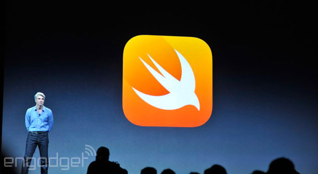
Beyond the above, the WWDC conference featured an extensive section of the advancements Apple has made from it’s Objective-C language to their personally pioneered “Swift” code as well as to the new Kits (HealthKit, TouchID access for third parties, Extensibility, SceneKit and many more) as well as what Apple calls Metal. The developer aspect deserves an entire article in is elf, however, since most of it would be gibberish to the common readers.
All in all, WWDC 2014 may not have been as revolutionary as it’s predecessor from last year but as has been said earlier: “It’s the little things that matter.”
is a 20 year old Karachiite currently studying Management Sciences in junior year at LUMS and his passions of particular significance revolve around indie music, thriller fiction novels and white chocolate. All of the aforementioned, however, are trumped by love for gadgets and all things tech.
Related Posts
SUPARCO Announces Pakistan’s Lunar Rover Naming Contest: Here’s How to Participate
The Pakistan Space and Upper Atmosphere Research Commission (SUPARCO) has revealed plans to launch the country’s first lunar rover in 2028 as part of…
After a Decade-Long Wait, Tesla Starts Hiring in India
Just days after Elon Musk met with Indian Prime Minister Narendra Modi, Tesla is ramping up its hiring efforts in the country. On its…


