Google Photos has rolled out a fresh update to its web platform, replacing the traditional “Library” section with a new “Collections” layout, following its August launch on Android and iOS.
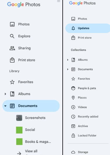
The “Explore” tab has been eliminated from the side panel as part of the redesign, and “Sharing” is now referred to as “Updates.” This updated activity display, which was introduced on mobile devices in early November, consolidates updates from shared albums, conversations, companion sharing, memories, and storage. Users can now access the overlay menu to access more detailed views of Sharing activities and Conversations.
The “Library” section has been rebranded as “Collections,” and its organization has been altered. The navigation options for Albums and Documents have been elevated for easier access, and Favourites no longer occupy the top position. In addition, users will be able to access fast connections to People & Pets, Places, Videos, and Recently Added, which are similar to the grid view that was introduced on mobile devices.
The menu options are completed by Archive, Locked Folder, and Trash in the updated layout. Although the interface is more complex, it improves navigation by providing more direct links to critical sections, thereby making the desktop experience more user-friendly. Users on the web are progressively getting access to the new “Collections” feature.

Old vs New


