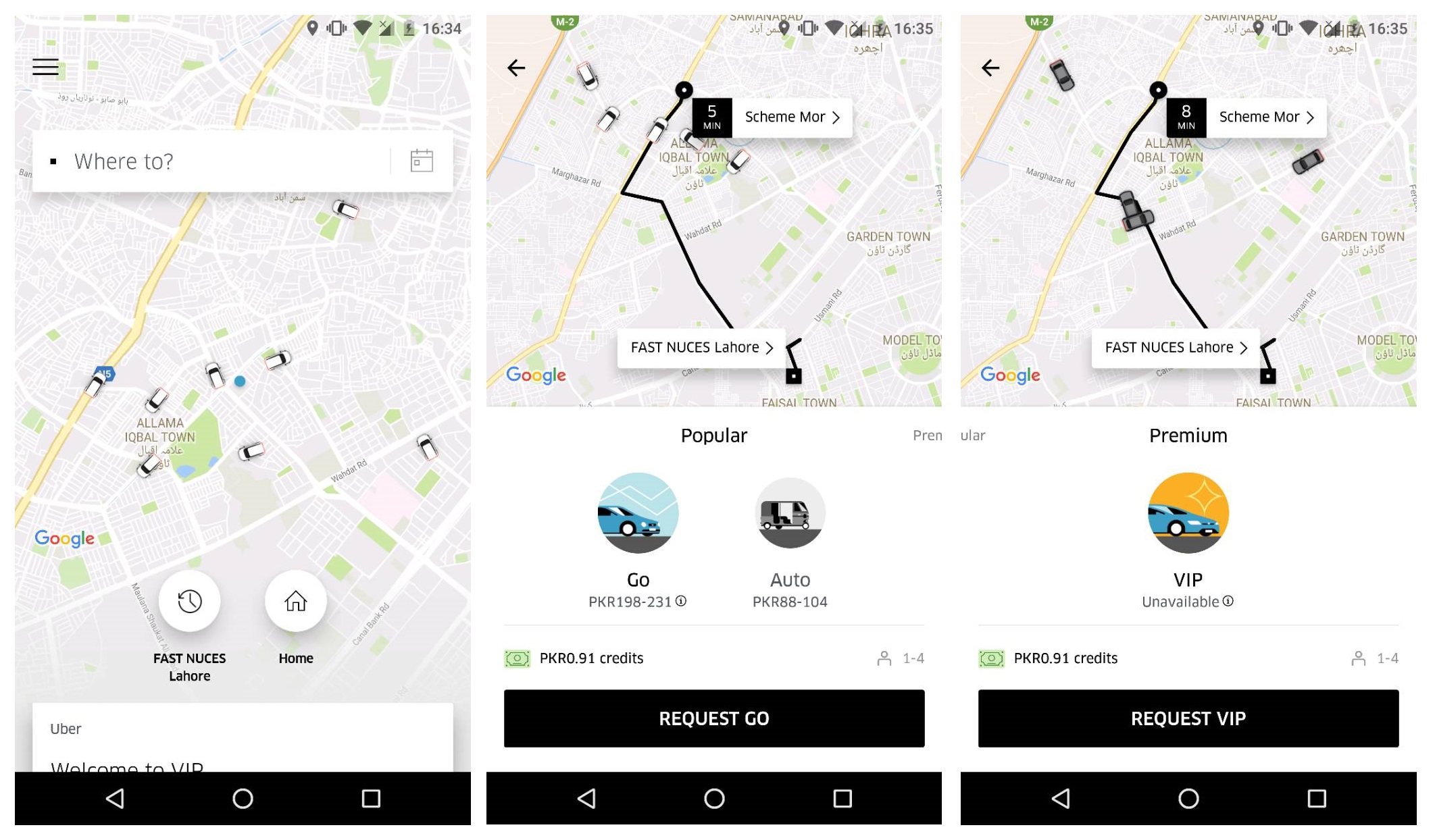
Uber has revamped the user interface on its app with the latest update. The new user interface now focuses more on the destination and provides quick shortcuts to plan the trip.
What has changed?
The app now starts by asking the destination of the user. This is a stark contrast with the previous design of the app which asked the pickup location first. The app also shows some shortcuts at the bottom of the screen which display some of your most visited locations. These may include your home, university etc. Tapping on the shortcuts or entering a location in the search bar brings up the ride choice menu.
 Fare estimate is now shown with all the options. You can swipe left or right to move between popular and premium options.
Issues with update
Although the update is pretty stable and works well, there is a weird bug which prevents the app from showing the estimated fare for the VIP option. However, Uber is pretty active with its app updates so it is expected that this issue will be fixed soon with either a client side or a server side update.
Availability
The update is currently live on both Android and iOS devices. To get the newest version, just go to the app store on your device and check for updates.


