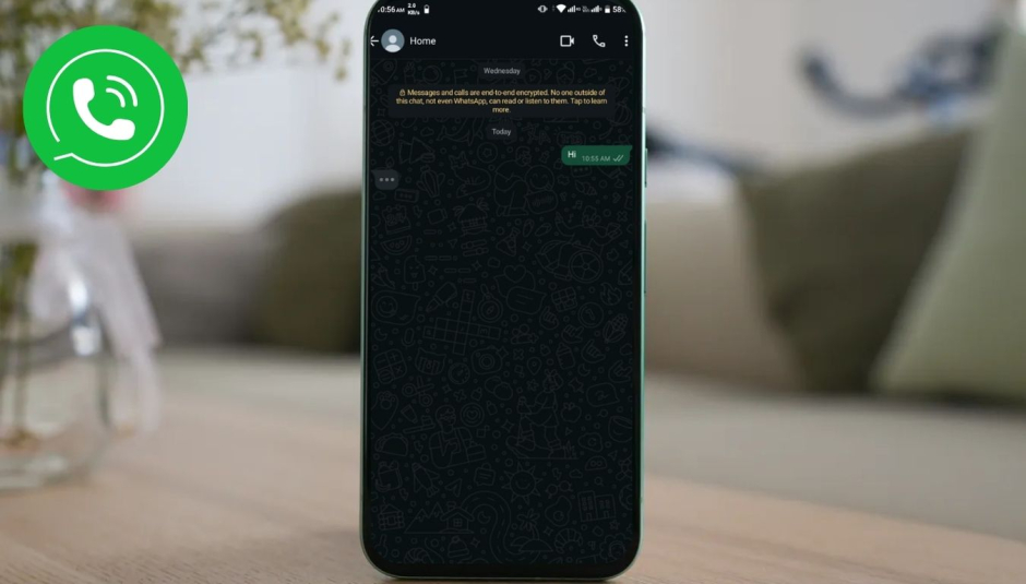
WhatsApp now features a moving bubble below the latest message, replacing the previous “typing…” indication at the top of the chat window. A lot of people have complained about the design, saying that it’s distracting.
Users are upset because this feature was rolled out without any prior announcements. The Daily Mail reports that this major improvement looks a lot like Apple’s iMessage’s typing motion. Many online users have expressed their disapproval, with many using terms like “annoying” and “unhelpful” to describe the situation.
WhatsApp, which is owned by Meta, has failed to handle the reaction in a way that would calm users’ worries. Despite the concerns, the upgrade, which represents a major change to the app’s interface, is going to be released worldwide soon.
Even if the animated bubble is trying to refresh the UI significantly, people aren’t sure if the changes will improve the user experience or just mess with the familiar elements.


