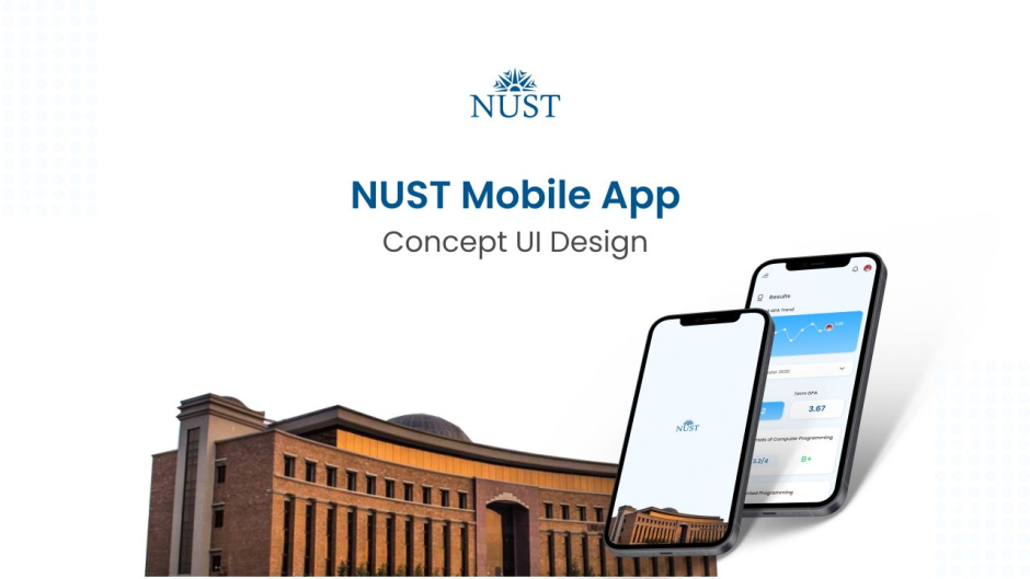
This university student didn’t like their mobile app design so he made his own

Ever come across an app and you just wish that its UI could be better? Designing is a complex process and it involves taking user experience into account while making sure each element and feature is in the right place. When the design is lagging, the overall experience of the software deteriorates and it is unenjoyable, to say the least.
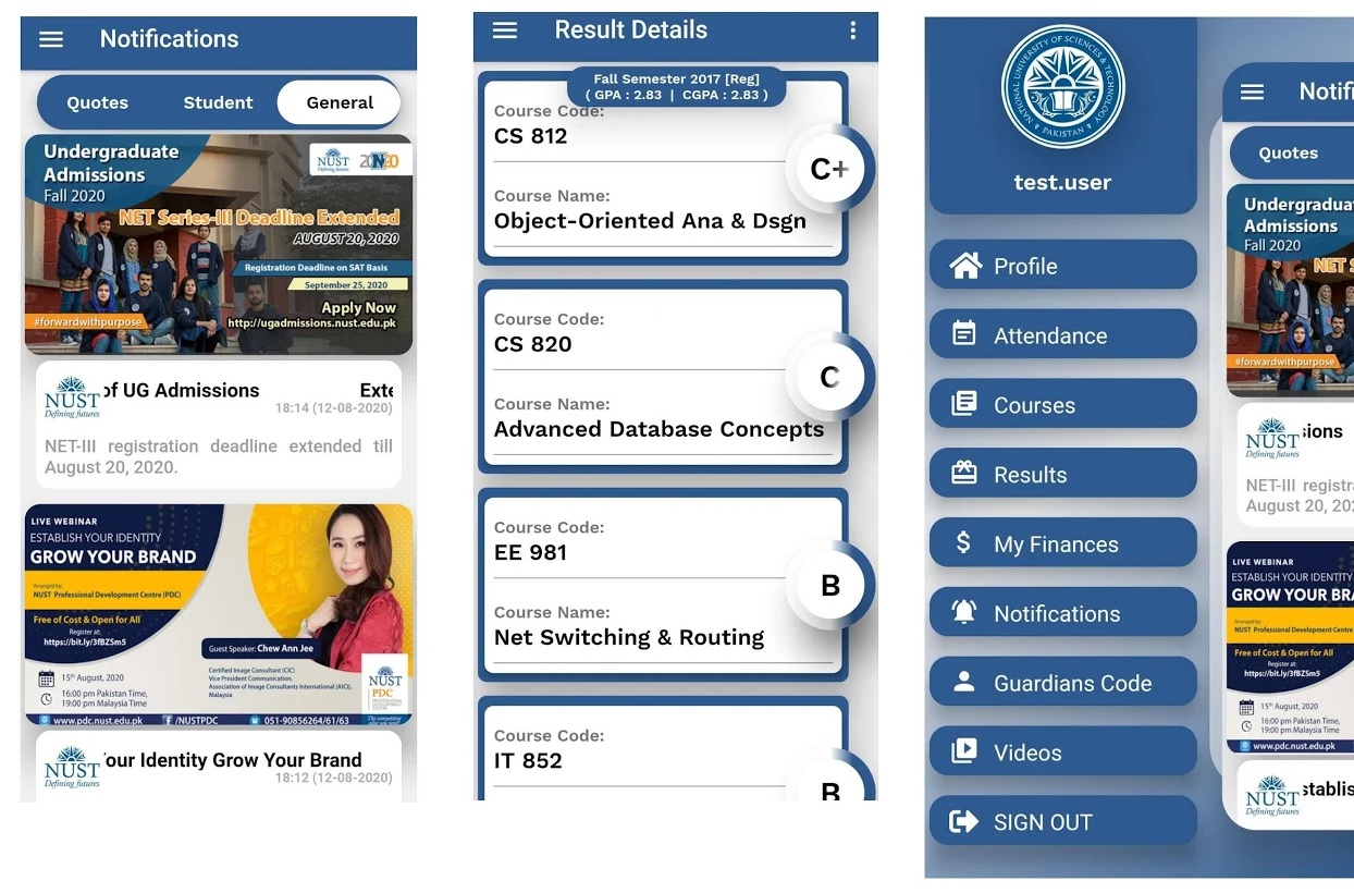
Such was the case of the NUST Mobile app which did get a design overhaul but still didn’t look that much appealing to the student who redesigned the app. Take a look at the current design below:
While the app design looks fine but there are noticeable UI issues and the overall concept feels boring.
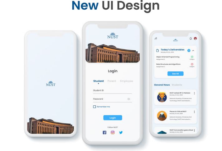
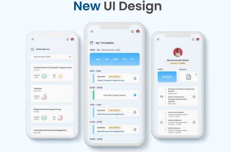
Muhammad Ubaid Ullah who is a Final Year student of Software Engineering at NUST-SEECS didn’t approve the design at all and according to him, the current design seems to be following the trend of 2010. But instead of ranting on social media, he took it upon himself and created a new concept design for the university administration to follow and aspire for which you can see below:
As you can see the above design has a sleek modern look and has a much cleaner feel compared to the existing app. He took the same features and requirements of the current app and elevated the design to a whole new level.
This is a classic example of how you can change perspective not just by arguing but through practical work which stands out. Ubaid has also created an interactive Figma prototype for the application which can be used here.
Content Team Lead. Blogger, Content Developer, Social Media, and SEO Expert. Reach out: [email protected]
Related Posts
PMDC to Decide Fee Structure for Private Medical and Dental Colleges
ISLAMABAD: The Pakistan Medical and Dental Council (PMDC) is set to deliberate on the standardization of tuition fees for private medical and dental colleges…
HEC Releases Updated Curricula for Sociology Degree Programs
ISLAMABAD: The Higher Education Commission (HEC) of Pakistan has introduced revised curricula for Associate, Bachelor’s, and Master’s degree programs in Sociology, setting new academic…


