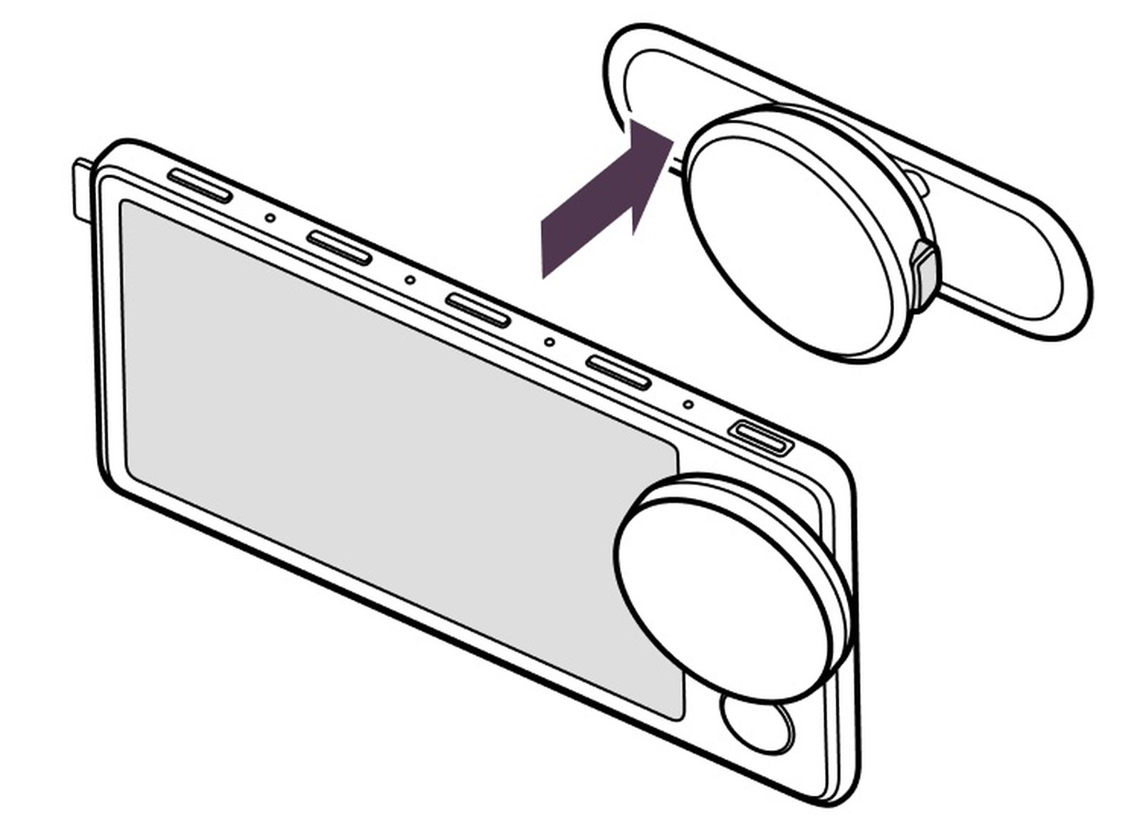
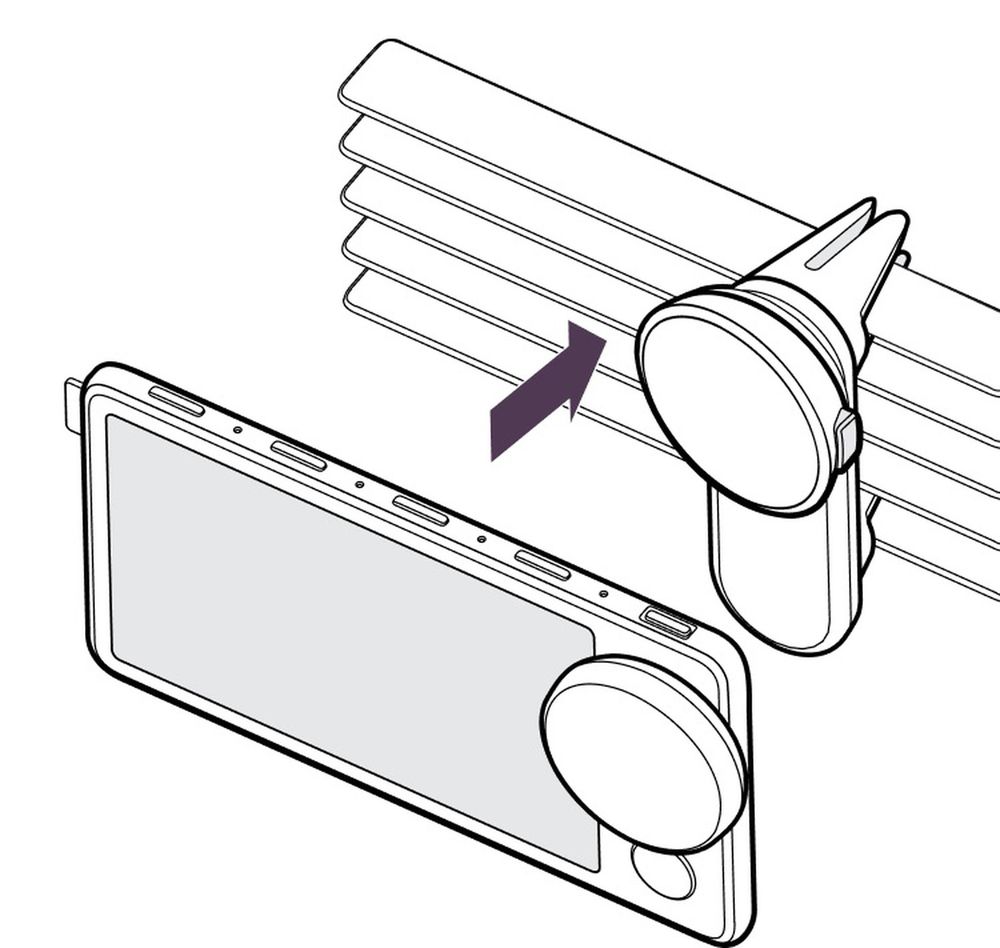
Spotify’s much anticipated in-car gadget called ‘Car Thing’ has shown up in numerous in-app renders which were released by MacRumors contributor Steve Moser who fund the images in Spotify’s app code.
These renders match up quite closely with photographs of the real deal submitted as part of filings to the Federal Communications Commission (FCC). As a result, we now know how Spotify’s Car Thing looks like in terms of design which includes a large knob on the right, a color screen, and four buttons on top.

Despite that, Spotify’s design has since moved much closer to a smart display style, which makes sense considering it now more closely resembles a miniature infotainment screen one would find in a modern vehicle. These new renders show off the screen and a possible interface design, in addition to various mount designs for attaching the device to different parts of the dashboard.

The term ‘Car Thing’ is not an official name for the feature and it is not confirmed when this feature will be released to the public.


