According to Nokia’s Chief Executive Pekka Lundmark, the change comes as Nokia no longer considers itself a smartphone company, rather a business technology company
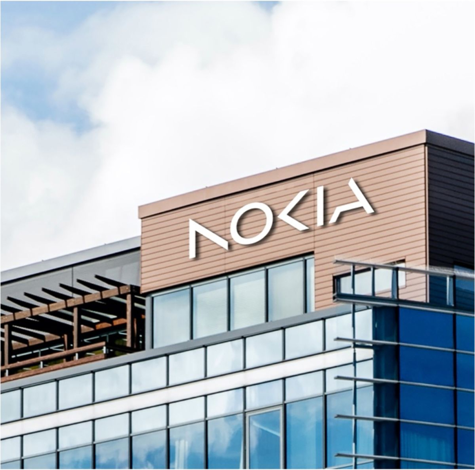
Nokia, which used to be a leading mobile phone company back in 2000s, just announced a rebrand where it changed both its logo and brand identity thus marking the first brand identity change it has had in over 60 years.
Having a lettermark look, the new logo is five different geometrical shapes that form the word ‘Nokia’, in a sleek and futuristic style. The new logo, while not drastically different from the previous one, has both a new look and colors.
Nokia’s previous logo was also a lettermark with the words ‘Nokia’ written in a bold font that had a strikingly calm blue color scheme.
According to details released by the company, this change in its logo and brand identity marks the end of Nokia’s mobile phone business and its expansion into becoming a business technology company.
“There was the association to smartphones and nowadays we are a business technology company” said Nokia’s Chief Executive Pekka Lundmark.
This news was revealed by Nokia’s Chief Executive at the Mobile World Congress (MWC), which was held in Barcelona and included representatives from some of the world’s leading technological companies.
Pekka Lundmark, who took over Nokia as CEO in 2020, announced that the company who has been struggling in the mobile phone market for quite some time had a simple three step plan. These three stages were; reset, accelerate and scale, and the company has successfully completed its stage one, where it has now gone from being a mobile phone company to a business technology firm.
How do you like Nokia’s new logo? Tell us in the comments below!
Read more:


