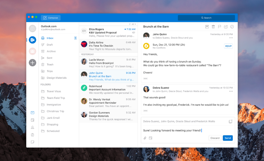
Microsoft is working on a major redesign for Outlook on Windows and Mac. Recently, Microsoft redesigned the Outlook on iOS as well and now it is planning to bring similar looking design to Mac and Windows as well.
It is a much-needed redesign as the current design of Outlook is quite cluttered and difficult to use. A new, simpler design will make the powerful client easier to use for everyone.
Microsoft showed off the new design at the Ignite 2017, which was held back in March. The overall design of the app looks a lot cleaner and more beautiful than the Outlook 2017. There’s a new ribbon design which is completely customizable. The left navigation bar will give you a quick access to all the folders like Inbox, Outbox, and drafts. You can add multiple accounts in the app and all of your accounts will be accessible through the left navigation panel separately.
Microsoft says that “MacBooks are popular amongst key influencers and decision makers,” and that the company “needs to win these users by delivering the best Outlook has to offer.”
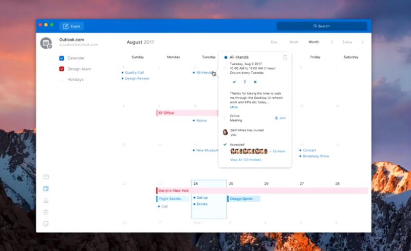
The new Outlook will also add improvements to search and calendar. Search is now placed on the top right corner of the app which means that it is now easier to access and is faster. The calendar is redesigned to better manage your events.
It is not clear that when this new design will be made available. It is possible that the new design will be the part of Microsoft Office 2019 which is set to release next year.


