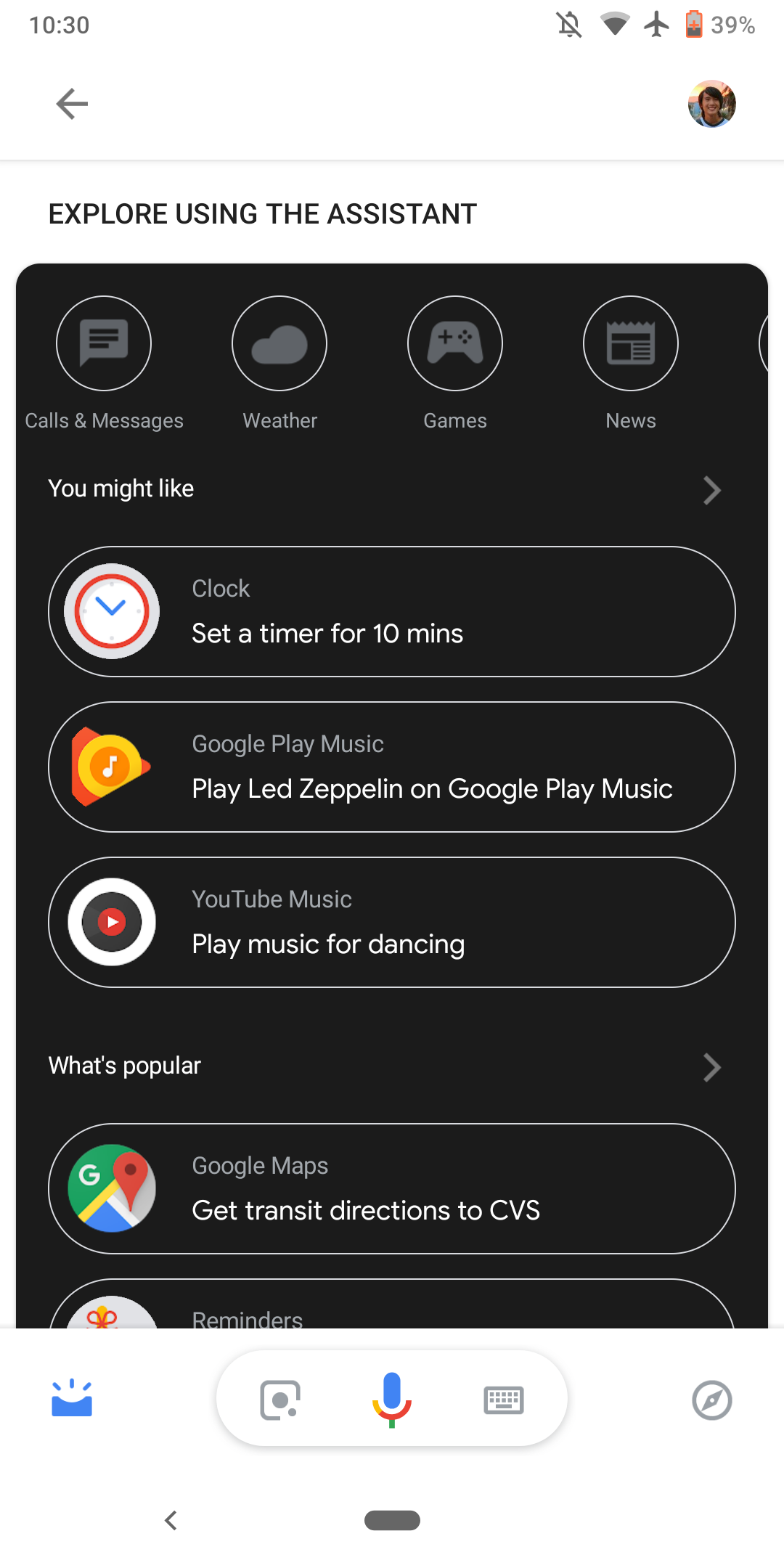
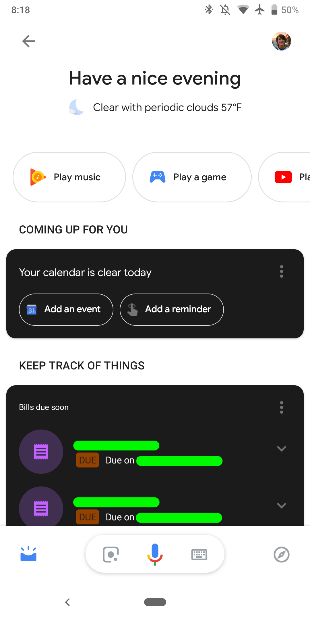
Google has been revamping its apps recently to support darker themes and has several updates planned before Android Q and its long-rumored dark mode launches. Google Assistant is the latest service to get the dark mode treatment.
Google has recently redesigned the Assistant app and has brought the controls and buttons closer together as well as new rounded corners. The Explore button has been moved to the right side and the Panel button is now situated on the left side. This update consisting of the redesign of the Google Assistant is going to be available to users who have the latest stable version of the Google app (v8.91).
Now, the company is internally testing a dark mode for the assistant app. Even though the basic working and functionality of the app work the same, the redesign gives a fresh look to the app.
The latest Google beta came out last night including cards that feature white text on black background. The dark mode will be enabled either when users have the battery saving mode running or when “Night Mode” is set on “always on” from the Android Pie developer menu. 
Clearly, the new dark mode is still in development as the rest of the interface mostly consists of black text on white background. In addition to that, the transitions from the regular view to the dark one are not yet seamless, often causing the users to lose what they were viewing due to the assistant reloading. Furthermore, opening the assistant on dark mode takes much longer time to launch than the regular view.
Currently, the Google app v9.5 is in beta and we don’t know for sure if the dark mode will be part of the update next week. It is very likely that this isn’t the final design of the app and that Google is working on making it more seamless.


