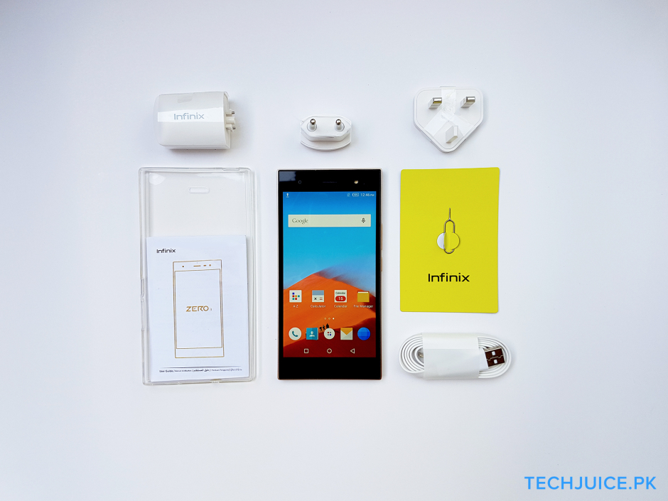
First Impression
The Infinix Zero 3 has some strong points but design is not one of them. The device is clunky and hard to handle with one hand. The screen is pleasantly bright but colors seem a bit washed out. The software experience is very close to stock Android. Though Infinix has added some worthwhile features that make the experience even better. Let’s dive into the specifications.

Key Specifications
- Display: 5.5-inch IPS display, Full HD resolution (1080 x 1920 pixels), ~400 PPI pixel density, Gorilla Glass 3
- Performance:2.2 GHz 64-bit octa-core Mediatek Helio X10, PowerVR G6200
- Memory: 16/32 GB internal storage, expandable storage (up to 128 GB), 3 GB RAM
- Communication & connectivity: Dual SIM support (2G/3G/4G), Bluetooth v4.1, NFC, USB OTG support
- Camera: 20.7 MP rear camera (Sony IMX230 CMOS sensors), f/1.9 with optical image stabilization, LED flash, 1080p video (at 30 fps), 5 MP front wide angle camera, f/1.9, 1080p video
- 20.7 MP with Sony IMX230 CMOS sensors, dual-color LED flash, with HDR, gesture shot, Slow Motion, Voice and Touch Gesture
- Sensors:Accelerometer, proximity sensor, gyroscope, compass, light sensor
- Battery: Non-removable Li-Ion 3030 mAh (Fast charging)

Pros
- Camera app has a lot of features, both rear and front cameras are bright and sharp
- Dual SIM card support
- 3030mAh battery with fast charging enabled
- Snappy performance most of the time
Cons
- Bulky for the screen size
- Feels cheap and plasticky
- Limited internal storage
- No support for Android 6.0 Marshmallow
- No fingerprint sensor
Hardware & Design

The Infinix Zero 3 is constructed of metal and glass, supposed to give it a premium look but the phone feels oddly substandard. The frame is made out of metal with a feel of plastic. Also, there are large unsightly chamfers on the left and right side of the phone’s back which make the rectangular look of the phone even clunkier. The back of the phone has a grid pattern underneath Corning Gorilla Glass 3 and the touchscreen is also protected by Gorilla Glass. The phone does not have capacitive or physical Home, Menu or Back keys. A power button and volume rocker are located on the right side and they are solid and offer good tactile feedback. The micro SD card slot rests above the buttons and the left-hand side carries the Dual SIM.

Display
The device boasts a large 5.5-inch Full HD IPS display. The viewing angles are great, as is nearly always the case with IPS display, but the color reproduction and vibrancy suffers. Reds and yellows are dull and vague. Infinix has added software features like a video fluency enhancer and a display picture optimization setting, but the visual experience is still average at best. Moreover, the screen is bright indoors but outdoor visibility is a challenge.

Performance & Storage
On the storage side, there is a room for improvement.
The Infinix Zero 3 houses the MediaTek flagship Helio X10 chipset, clocked at 2.2 GHz, along with a PowerVR G6200 for the GPU and 3 GB of RAM. It performed well during day-to-day use and the device also handled multi-tasking well. There were a few instances of stutter and lag when it came to gaming, which is a bit of a downside. Also, processor-intensive tasks caused the phone to heat up, but it wasn’t so much as to make the device hard to hold.
There are also multiple performance modes that include a High Performance mode that increases CPU output for enhanced functionality. Whereas, normal mode offers balanced output for everyday usage. Power saving mode tends to lower performance output to extend standby time.
On the storage side, there is definitely room for improvement. In the present time, 16 GB of internal storage is just not enough. Especially in this device, because less than 11 GB is available to the user which is a bit disappointing. There is room for a micro SD card but if you’re a gamer or just someone who likes to have lots of apps on his/her device then this phone will disappoint you.


Battery Life
A 3030mAh non-removable battery is present under the hood which lasts a day on normal usage. Around average, the device gets 5 hours of screen-on time which is sufficient considering the screen size and octa-core processor. There is fast battery drainage when connected to a 3G or 4G network but the device makes up for it with the availability of fast charging.
An additional feature is the Heartbeat sync which controls apps to prevent the device from being frequently awoken when the screen is off. Previously, this could only be done with the help of a third-party app and root permissions.

Camera
The camera is definitely the selling point for this device.
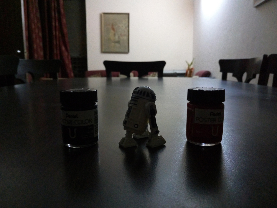
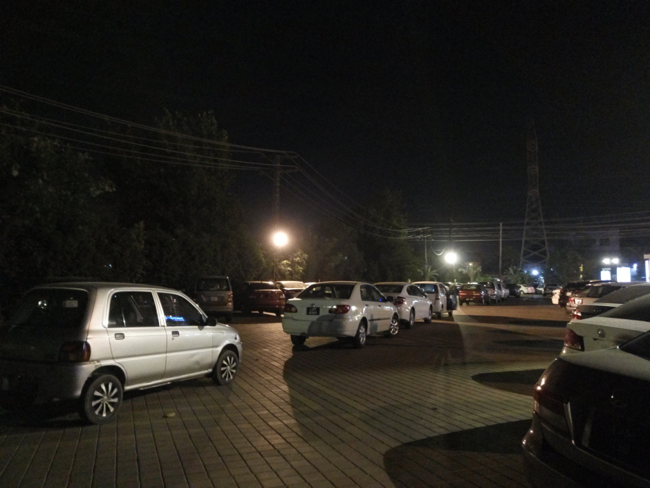
The camera is definitely the selling point for this device. The 20.7 megapixel rear camera is sharp and color accurate (at least in daylight). It contains the same Sony IMX230 CMOS sensor that is present in the Moto X. It is combined with a 6P Largan lens to retain vivid details even when enlarging or cropping. The high-resolution images allow for cropping and editing freely. Colors are not oversaturated and there is little destructive noise reduction which results in sharp and clear images. Low light performance could be better but for a device in this price range, it is acceptable. It also does not help where the dual-tone flash tends to overexpose.
The highlight is the camera app which includes a multitude of useful features. There are some surprising flagship features like a simple but functional professional/manual mode that resembles the ones present in Samsung flagships. There is also a slow-motion video capturing mode courtesy of the Helio X10.
Software
The UI is pretty responsive and does not lag most of the time.
Thankfully, on the software side, Infinix has preferred an almost stock-Android skin. It is called X UI and it is Infinix’s own product but the biggest issue I saw was its striking resemblance with LG’s UI of Lollipop. The icons were nearly the same and the user interface did remind me of the G3 and G4’s interface.
The UI is pretty responsive and does not lag most of the time. There are occasional hiccups and stutters but they are not very noticeable. There are minor optimizations that make the user experience a delight.
Memory Manager: There’s a pop-up button/indicator at the bottom of the Recent Apps screen which shows how much RAM is being used and also provides a memory cleanup option.
Notification Bar: The notification bar includes the usual quick settings but the drop-down also includes options like screen recording, high performance mode, and an ultra-power saving mode.
Quick Actions: A plethora of quick actions are available that allow you to double-tap the screen to lock or unlock the device, a one-handed usage mode and the ability to take screenshots easily with a 3-finger swipe gesture.
Standby Network Management: There’s a feature that prevents apps from accessing the network when the screen is powered off and in standby mode.
Everyday Use & Personal Opinion
What the phone lacks in design, it makes up for in performance and software optimization. Infinix has managed to make a functional product that is likely to impress the average consumer with its extensive set of features.
The Infinix Zero 3 has a lot to offer to beginner smartphone users. This phone is targeted toward someone who just wants a smartphone that has some of the latest flagship features but doesn’t need to look or feel like a premium device. Personally, this phone feels a bit toyish. Its design is clunky, unimaginative and lacks practicality. The materials feel cheap and the squarish frame of the camera irks me to no end.
I used this phone as my daily driver for around 5 days and what impressed me was that I didn’t experience as much lag as I thought I would with a device of this price. The UI was smooth, and switching between apps didn’t put a strain on the processor. What the phone lacks in design, it makes up for in performance and software optimization. Infinix has managed to make a functional product that is likely to impress the average consumer with its extensive set of features.
If you’re a power-user, this device is not for you. The conclusion that I reach after using this device to its fullest that it has the potential to be someone’s first phone. It does not cost as much as entry-level Samsung smartphones and yet has many of the features that are normally expected from flagships.
The phone is available at Daraz for Rs. 20,899 as of this writing.
