Google, the search giant, has again surprised everyone by revamping its logo.
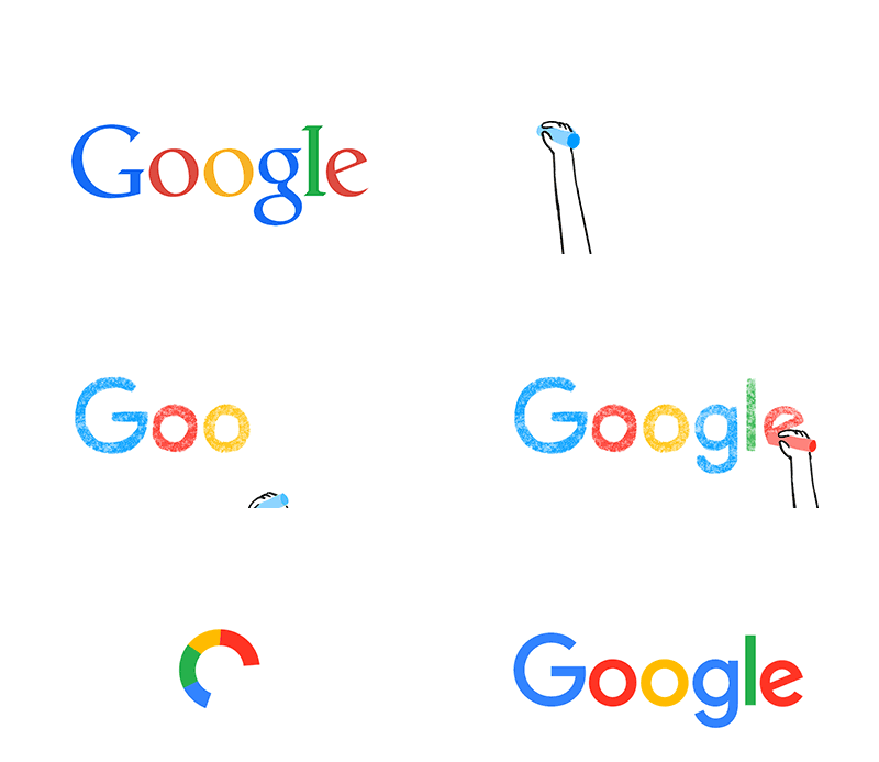
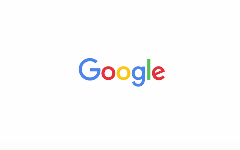
Google has now a new minimalistic-yet even more boldly colorful logo, which is a really big deal because this is probably the biggest change to the Google’s logo since 1999. In 2010, it got a little flattening done and then in 2013, some more minimal changes were made. But this time, Google has let go off the curvy typography and it’s now looking completely flat.

Google is easily the most-visited site on the internet on this planet, so everyone who has even heard of the internet (pretty much everyone) knows what Google is, and has also seen the colorful logo. Despite the fact that almost nobody will be able to recall the exact colors of Google’s logo, it is immediately recognizable by anyone.
After restructuring the whole company under a new umbrella, Alphabet and naming a new CEO, this is another big decision the California-based company has taken in an incredibly short period of time.
Easter Egg: Search for “Google logo history” on google search for some cool animations.


