Google Translate finally gets the long awaited material design makeover with some additional functionality

Google has been rolling out material theme designs for a lot of Google apps in recent time and it seems that the material look has finally reached Google translate. The update was earlier spotted in October and is now rolling out on a massive scale for Google translate on Web. Historically Google’s products have either been a ‘Hit’ or a ‘Miss’, from the highs of Gmail and Maps to the lows of Google+ or Glass, all have been part of Google’s portfolio. Fortunately, Google translate has been one of the successful experiments by the search giant.
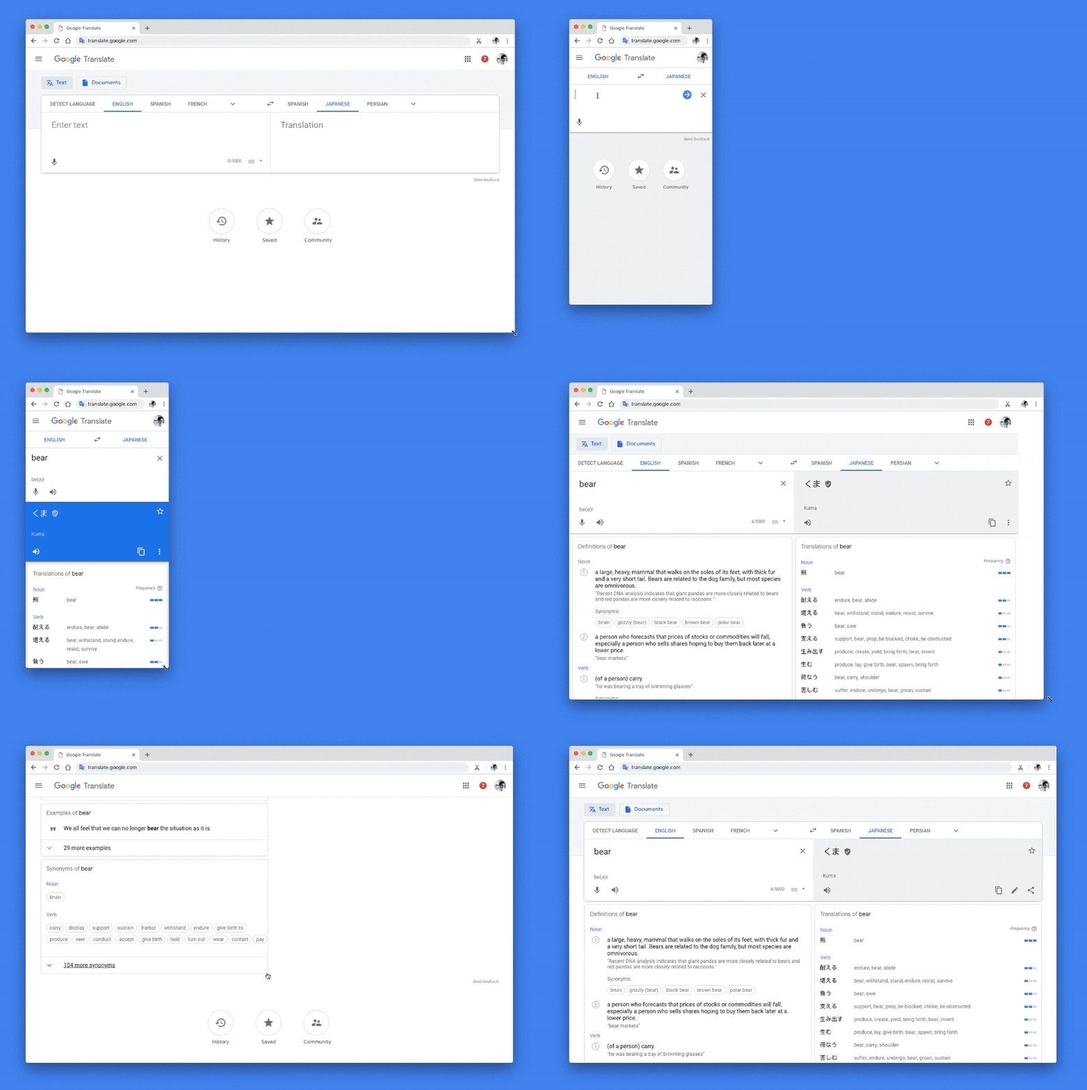
The new Google Translate website has the same layout with two fields for language input and output. There is also now an option available to switch between entering “Text” and uploading “Documents” underneath the app bar. This new update is focused more on revamping of the layout of the web version of Google translate while also adding new functionality. The design language is updated using the same ‘updated labeling and typography’ which has also been used on Google’s other products as part of Google’s new material design program. The new design language makes navigation of the website easier for the user according to Google’s product manager, James Kuczmarski. The new functionality makes it much easier to organize and save translations that have been used or searched for. Furthermore, the website is now more responsive to different screen size adjustments hence allowing a more coherent and consistent experience across smartphones, desktops, and tablets. 
In a recent blog post, James Kuczmarski lauded Google’s efforts in making Google translate a huge success and expanding it to other languages. Initially Google translate was only limited to English-Arabic and vice versa, however ‘Google translate’ now translates 30 trillion sentences per year across 103 languages. Kuczmarski also mentioned the improvements that were made in Google Translate on Web with the latest update
Sharing clear, practical insights on tech, lifestyle, and business. Always curious and eager to connect with readers.


 2 min read


