Google to bring Material Design to Docs, Sheets, Slides and Sites

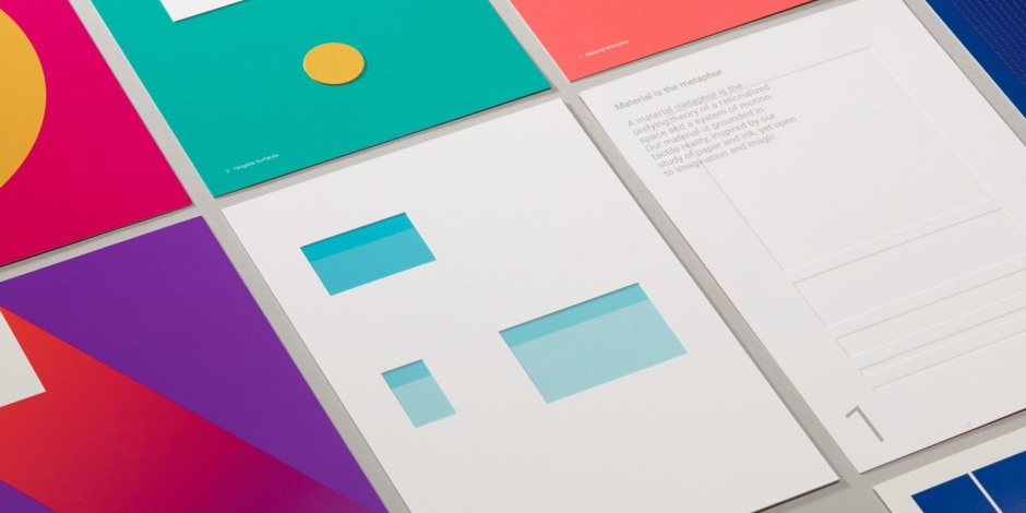
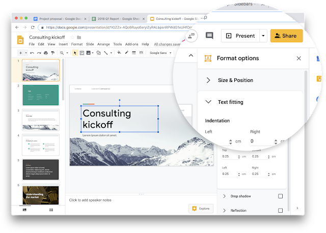
After first testing the Material Design theme on Drive last year, Google announced today that it will roll out the theme on Docs, Sheets, Slides, and Sites as well.
It is worth noting that this update is going to be nothing more than a revamp of the design. There won’t be any new features or any other kind of changes for that matter.

When you do get the update, you can expect to see new iconography that is crisp and legible, revised controls (buttons, dialogs, and sidebars) and different fonts on the interface. There will also be a set of fresh colors to adhere more closely to the Material Design guidelines.
So when exactly this update will be rolled out? As it happens, that kind of depends on what kind of user you are.
Google is starting to push this updated design for all G Suite subscribers who are on the Rapid Release schedule. So if you are a G Suite subscriber, you can expect to see the update within 15 days.
On the other hand, the users on the Scheduled Release schedule will get to experience the new, aesthetically pleasing design by 11 February. Google usually doesn’t state when such new features will be rolled out to free users, but they can expect to see it on their devices within the next month as well.
As anyone who has been interacting with Google’s products for quite a while already knows, the tech giant has been rolling out updated designs for most of its web and mobile apps over the past few months. Google Calendar was one of the latest apps to receive this update, and now that the G Suite productivity apps have been updated as well, this project is heading towards its completion.
Platonist. Humanist. Unusually edgy sometimes.
Related Posts
Apple to Release Enhanced Studio Display by 2026
Apple is said to be developing a successor to its Studio Display monitor, with reliable sources indicating that the release won’t be happening anytime…
CDA to Strengthen Digital Security with IT Directorate Overhaul
ISLAMABAD: The Capital Development Authority (CDA) has taken a significant step to improve its digital security by deciding to hire a cybersecurity firm. This…


