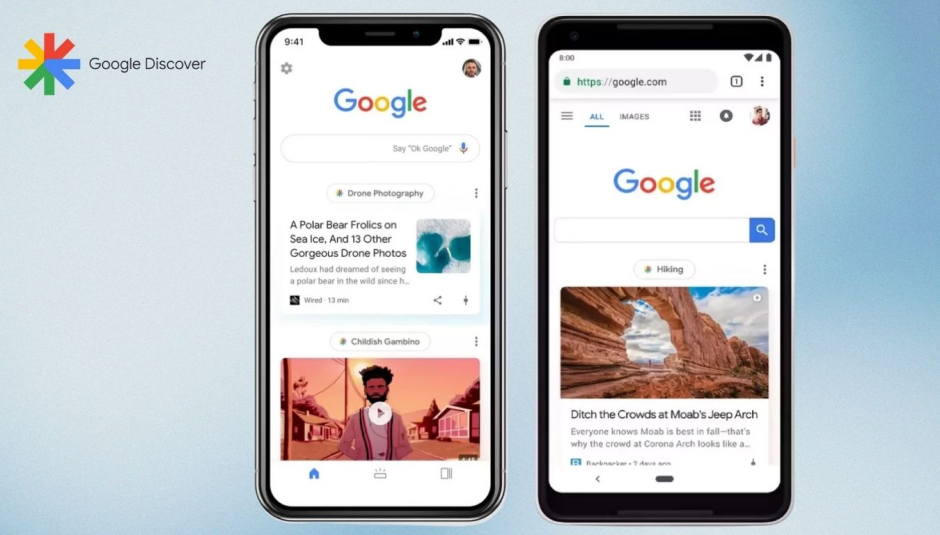
Google Discover is compatible with the majority of Android phones available today. You can use it to stay informed about today’s top news headlines or any other subject that interests you. Both the Google app and the Android home screen provide access to this personalizable experience.
Discover isn’t exactly a product that undergoes frequent upgrades or modifications. The most recent noteworthy change was the upgrades from the search feature, which is still in development and hasn’t been publicly released. For subjects that appear on Discover, Google is currently making changes to the Material You design.
New Era for Google Discover
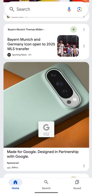
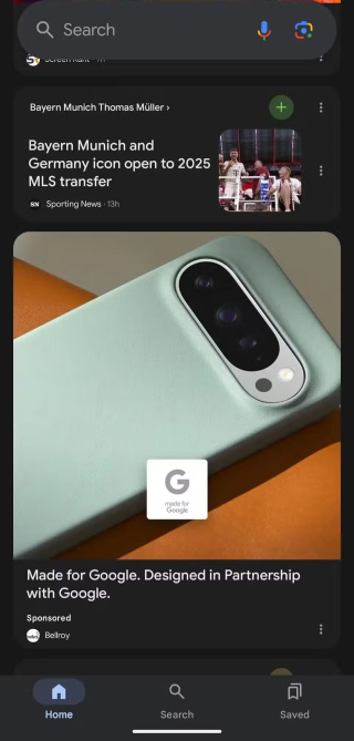
The current design of the Discover feed has been mostly static for some time. However, according to the Material You redesign that was originally noticed by 9to5Google, the horizontal line that separated the information is also gone, and each item now has its own card.
With the removal of the specific share and save buttons from the card, the accompanying images for each Discover item are noticeably taller. They are now inside the single extra menu button instead. Google is clearly aiming for a more minimalistic style here, even though it’s far from flawless.
Why Does Google Discover Have Two Overflow Menus?
Furthermore, a new type of card is now under development that will propose an appropriate subject and provide an easily accessible plus button for adding it, in addition to these design changes for Discover items. Having two overflow menu buttons—shown below—is what makes this card unique. Google will probably eliminate one of the options in the next version, but it’s not clear if they both serve the same purpose.


Another change seen in these screenshots is the elimination of the Notifications tab from the previous version, leaving only Home, Search, and Saved in the bottom bar. Reportedly, these updates are rolling out to Discover with Google app beta v15.43, though it’s currently accessible to a limited group of users.
Keep in mind that Google is often trying out new design tweaks, not all of which end up in the stable version. There is currently no confirmed date for when these updates will roll out to the stable version of the Google app.


