Gmail mobile app with updated material design is now rolling out

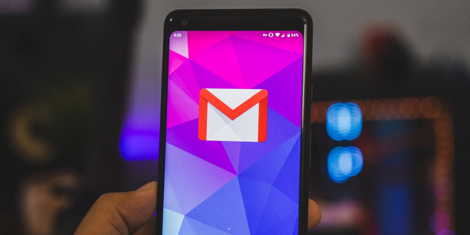
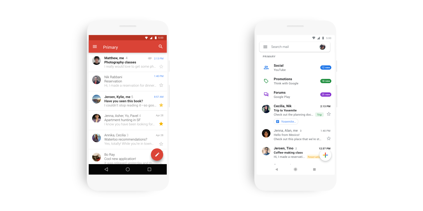
Material Theme redesign which rolled out on the Gmail web last April now begins to roll out for the Gmail mobile application as well. In a blog post on Tuesday, Google announced that the update not only brings the redesign to synchronize the design and features across all platforms, but it has also gained a few important features for the mobile application to improve the overall emails checking experience.
The new design offers a slicker and cleaner user interface by removing most of the app’s accent colors and by sticking with a flat white design. However, Google will retain the bright colors for smart groups and alerts to help distinguish between different areas.
Just like web users, Gmail app users will also be able to reply to the emails quickly now with the Smart Reply feature. Smart Reply uses machine learning and suggests three appropriate replies to the message, and as soon as the user presses any of the options, it gets posted as the answer.
Google said, “Today, we are kicking off the new year with a new look for Gmail on the mobile, too. As part of the new design, you can quickly view attachments, like photos without opening or scrolling through the conversation. It’s also easier to switch between personal and work accounts, so you can access all of your emails without breaking a sweat. And just like on the web, you’ll get a big, red warning to alert you when something looks phish-y.”
Related Posts
Samsung Confirms Galaxy S25 Camera Problem, Working on Solution
During January’s Galaxy Unpacked event, Samsung revealed the highly anticipated Galaxy S25 series. Some customers experienced camera difficulties, especially banding artifacts in photos, just…
OnePlus 13R vs Galaxy S25: Which Phone Offers Better Value?
The OnePlus 12R delivered great performance at an affordable price, and OnePlus is looking to repeat that success with the 13R. In contrast, the…


