Firefox Gets A Redesign With New Floatier Tabs
In recent news, Mozilla gave a new redesign for Firefox where the main focus has been on the outlook of the tabs. The new tabs are bigger than before and they now float above the toolbar near the top of the browser.
To get a better understanding of this update you can check the image below:

Moreover, Mozilla highlighted that this new detached design is a helpful way to enable users to move their tabs around as stated in their blog as follows:
“We detached the tab from the browser to invite you to move, rearrange and pull out tabs into a new window to suit your flow, and organize them so they’re easier for you to find.”
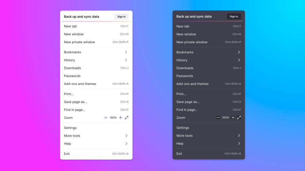
Apart from the tab changes, the company has made the toolbar less cluttered which is a better improvement over the previous one. In addition to this, there are more streamlined menus as shown below:

All in all, it seems Mozilla is working hard to keep up with Chrome and Microsoft Edge in the race for the best browser.

A tech enthusiast, writer, researcher and strategist working on the latest technologies and making an impact. Usman has been heavily focused on building communities, empowering people through technological trends and advancements for over 3+ years including many notable names such as IEEE Region 10, TEDx, Google Developers, United Nations Programmes, Microsoft Partner Program and much more. Reach out: [email protected]


 2 min read


