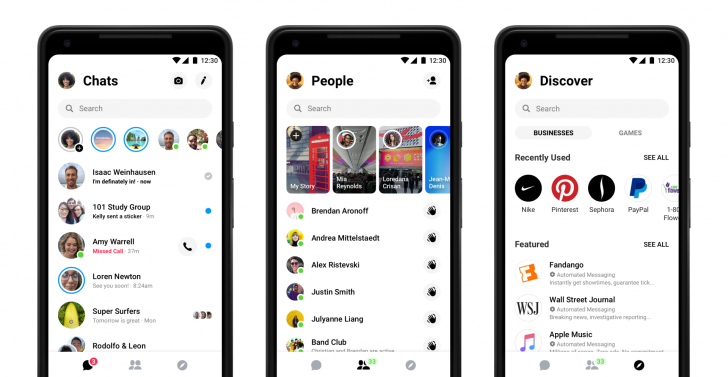
Facebook was rolling out a simpler and cleaner UI for Messenger which has more than 1.3 Billion active users with trimmed down number of tabs and more focus on the core functionality of the product but then it reverted it for many users. The redesign was first shown during its F8 conference in May where they also promised to introduce a dark mode in near future.
The new UI has a total of three main tabs which you can see in the picture above. They are following an all-white aesthetic which is also being followed by Google in its Material design. When I first saw the re-design, I was pleasantly surprised by how clean it is plus they have also changed the notification tune which sounds like a drum now, I personally preferred the old one. In the new UI, you will see that there will be a big difficulty communicating at night time with unless a dark mode is launched soon which is also beneficial for the battery life of a smartphone.
The redesign was available to many users including on my Nokia 6.1 but Facebook has rolled back the redesign for some reason. Maybe only a few users were intended to test out the functionality but instead, the update rolled out to the masses. Facebook hasn’t commented on the matter yet.


