Careem unveils its new logo

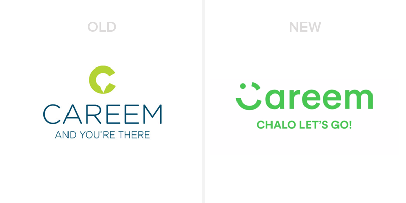
Careem, ride-hailing service, has unveiled the new logo of its brand along with a tagline ‘Chalo, Let’s go’. The new logo has a different green hue and ‘C’ of Careem is shaped into a happy wink emoticon.
The previous logo of Careem had a location pin hidden in ‘C’ with a tagline, ‘And You’re There’. The old tagline was focused more on destination, getting there, quickly. But the new one is more about taking an initiative, going out — in short, it is a call to action. Here is a quick look at both of the logos.

Although, the new winky logo of Careem is not expressionless anymore but, personally, it reminded me of popular frozen yogurt chain, Yogen Fruz.

On the other hand, owing to an expression, people will relate to it instantly. Because the wink is a universal emoticon, but it might be difficult for the users to recognize the service Careem through it. Let’s see, how the service is going to make the new logo memorable for users with respect to Careem.

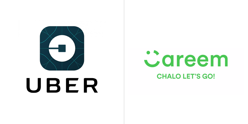
Uber, just recently, also unveiled their new logo, which, although, got huge criticism but users have finally made peace with it. If we look at the icon of Uber alone, it is still unique and singular, but I am not sure if the winky emoticon of Careem will be able to make a special place in the hearts of users.
![]()
[interaction id=”57de8585ec3cf49f6efd741f”]


 2 min read


