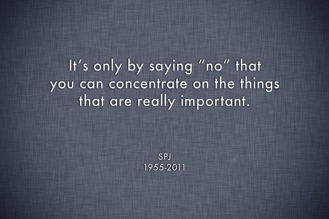
Designing a product that is loved by its customers is a daunting task. It’s tricky because you don’t know before hand what elements of your product are essential and what are extras. Saying No to non essential elements is just as important decision as it is saying yes to essential ones.
It’s no secret that most products fail because designers/entrepreneurs designing the product didn’t said No to enough number of features while designing them. But saying No is not so easy. It’s not just a word. It is perhaps the most important element of your product strategy. Below are five common traps that you may find yourself falling in every time you decide to say No to something.
Data looks good
You ran an online survey and results show that a certain feature is heavily demanded by customers. The problem with these surveys and data gathered through them is that they are very selective. It is highly likely that customers who are your true fans and who speak on your behalf may have never answered any question from that survey. They may be happy enough with your existing product that they never asked for anything more. So for a selected group of unhappy customers you may end up adding something to your product that your long term customers may not like.
The survey may also show that if a certain feature didn’t got added, a few customers will stop using our product. For such situations, always remember that a few unhappy customers are not bigger than your product.
Even if a feature demanded by customers seems great at first. It still may not fit well with your product. Traction is not always good.
It’s easy to add
Never, ever do this. The scope of work should not define what and what not should be added to your product. No matter how minor change it is. If you are not sure that it will make your product better, don’t add. Attention to detail is very important. And it is as much as important as it is adding some cool little surprise as it is to avoid making small changes that are really not required.
Often these small changes will have huge effect when the actual product comes to life.
It’s optional
Adding something on the assumption that we can hide it or make it optional is called death by preferences. User don’t normally like huge pages full of options that they may never use. These optional features will add to the overall complexity of your product and will destroy the look and feel.
Even if these options are buried down in user interface, users will try to explore them and may get confuse in the process. They will get the illusion that they are missing the trick because they don’t understand something in that long tail of options.
The result of all this will be a weaker product.
It’s new and innovative
There is no harm in trying out different things inside your startup. But don’t mess up your product just for the sake of innovation. Creativity and innovation are often the lifeblood of a startup. So do try out different things but make sure that you add them to your product only if you are sure that it will improve the product. Just because you have a new idea and it looks cool does not mean that your product should have it.
Just like it is impossible for you to implement every great idea in a way that customers love. It is also impossible that every new idea or innovation will make your product better.
Someone else will
One of the most dangerous trap that an entrepreneur often falls into is the race to have something new first, before anybody else. If I didn’t do this, someone else will.
You should have an eye on your competitor’s work but don’t be obsessed with it. If they have done something, it does not mean that you should do that too.
Normally you should avoid this race. This is true even if your product looks exactly the same to that of your competitor’s. The point here is that your customers may have a very specific reason to chose your product over your competitor’s. Following the path of your competitor you may take away that very reason from your product.
Conclusion
Have you ever wondered why more people are playing Flappy Bird and not quite as many Call of duty. It’s because Flappy Bird does not require much of knowledge before hand as does the Call of duty. You open it, tap it and off you go. Same is not true for Call of duty.
Designing a product that is simple requires that you at least say No whole a lot more. The more you say yes the more complex your product will become. Complex products require more attention from their customers which is rare and precious. Depending on your product you must say No at least ten or hundred of times more before you say Yes. That’s how important it is.
Image Credit: Flickr


