If you are a nerd, a developer or anything in-between; articles, videos and images related to the Google I/O 2014 might have taken over a better part of your social media feed by now. This year’s I/O may have been short on Nexus- or Google Glass-related announcements but those were more or less the only things we didn’t hear about during the keynote. Everything else was there, expected or not: Android’s latest ‘L’ release, Android Wear, Android TV, Android Auto, new tools and features for developers, and most importantly: Material Design.
Material Design 101
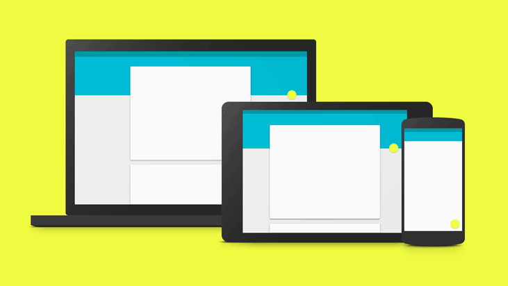
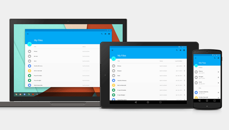
Material Design is the new design language that Google has envisioned for its products and services, and it’s pretty much in-line with the leaks that we have seen in the recent past. Material Design relies on minimalist, clean and simple, card-based interfaces. Google wishes to see its implementation across all platforms, be it a smartphone, a tablet, TV, PCs or even wearables.
If the developers and OEMs agree to opt for the design principles laid out by Google, we can expect to see a simpler and consistent web and mobile experience in the following months.
It’s (mostly) about Perspective… and Cards
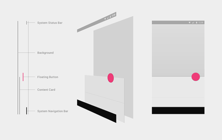
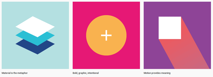
Depicting a major shift from Android’s current Holo UI, Material Design is claimed to have drawn inspiration from paper and ink alongside adding the likeness of physical surfaces and edges, and the extended capability of reforming and reshaping the UI elements in response to user’s interactions. The major driving thought behind this design language is flatness and the depth of UI elements.
Most of the UI elements—from notifications that appear right on the lockscreen and hover over running apps to dialog boxes, and from Recents that show individual tasks running on the phone to stackable surfaces—use the familiar card-based surfaces we know very well from Google now.
Material Design libraries will enable developers to define the “elevation” value for these card-like UI surfaces. The underlying framework will then automatically add virtual light-sources and real-time shadows to such surfaces accordingly to give out an air of perspective and position to the user.
Typography, Layout, and Adding the Colors
In Material Design, Android’s signature Roboto font has been tweaked to make it more readable and well-suited for display sizes ranging from 1.63” smartwatches to 10-foot home entertainment screens.
Another new feature—Baseline grid—is meant to set a reference layout for the smartphone apps, and scale it for larger displays like tablets and desktops, thus aiming to solve the layout problems faced by a huge number of apps when they are used on a device they were not originally optimized for.
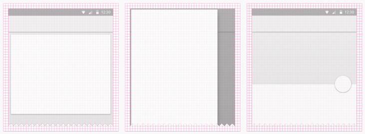
Moreover, there’s a new support library called ‘Palette’ which gives developers the ability to extract colors from images and fill the associated UI elements. A ranges of swatches, themes and palettes is also available at the Material Design’s webpage as resources. Google encourages the use of bold primary, and vibrant accent colors to make the important UI elements stand out.
Buttons and Animations
Floating circular action buttons are a major highlight of the Material Design, and they represent a promoted actions, like ‘Add a Contact’ in ‘People’ app and ‘Compose’ in the E-mail app. Other types of buttons include Flat and Raised, and Icon toggles among others.
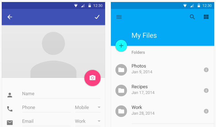
The buttons presses and UI element transitions implement inherent animations which provide a visual context of user’s interaction in the form of subtle ripples and emerging points of new elements being created. Animations can be set up not only for in-app activity-to-activity transition but also for app-to-app transitions. The animations run at 60 FPS to ensure a smooth and fluid experience.
Unifying the Interfaces across platforms
Google announced a rich web application UI library called Polymer at last year’s I/O. Polymer’s capabilities are now being extended to include all features of Material Design as well. With this, Google hopes to reward Polymer developers who went for it right from the beginning, and lure in others as well. For the mobile part, there are well over 5,000 APIs that comes with Android L’s SDK which include the framework for designing MD-based elements.

When to expect all this Material Design goodness?
Not real soon, is the shortest possible answer. For the mobile devices that come with Android’s L release preinstalled or the factory images for current Nexus devices, users will have to wait until later this fall, since the latest version is still at Developer Preview phase.
As far as the web-based applications are concerned, Google itself is yet to implement MD in its own services like Gmail and YouTube. How long it is going to take is yet to be ascertained, but if you want a sneak peak of how things are going to look like, you can check out the design principles Google laid out for developers here, and the Polymer Project’s prototype web-apps implementations here.
Android L’s Developer Preview, however, is available for developers to play with right now, and it can be accessed from here.
Sneak Peak
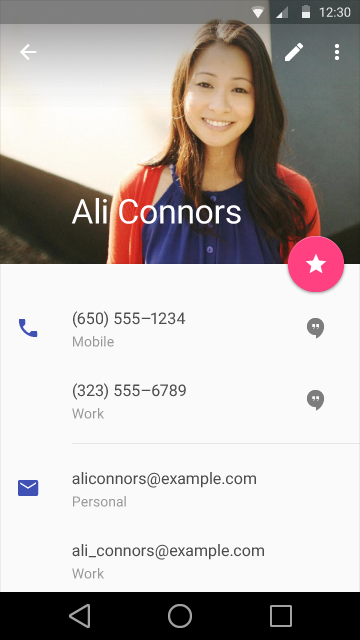
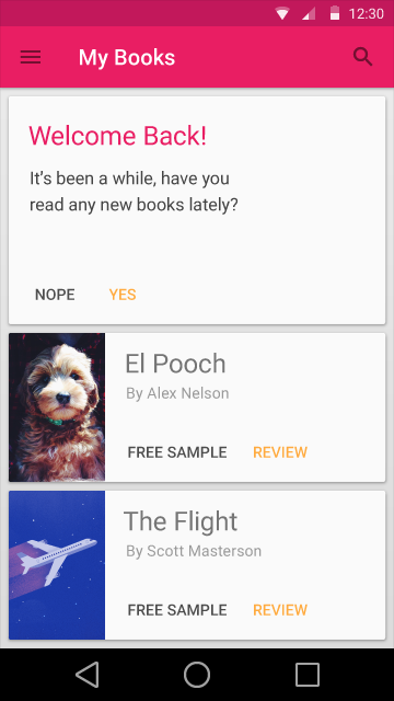
Here are some sample screenshots from the upcoming Android L.
Conclusion
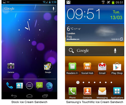
Google’s announcements, tools and design language philosophy, however innovative, clean or usable, will ultimately depend on the developers and its partner OEMs for implementation across the intended platforms. Google’s efforts can be overshadowed by a general lack of interest, or mere laziness of developers, in the adoption of the new design principles for app development. Android’s associated OEMs also have a history of using customized skins on top of standard OS UI that at times appear cartoonish or vivaciously over/under-colored. Google will ultimately have to throw its weight around if it wants the new Material Design language to take off.
This, of course, will be challenging, and we’ll have to wait until the first batch of apps gracing Material Design philosophy make their appearance before making assumptions on the matter.
