The much awaited Google I/O keynote kicked off at the Moscone Centre in San Francisco at 9:00 AM and although it lacked the flair and showmanship us techies have come to expect of Apple’s namesake events it was still packed to the brim with answers to questions that were growing more and more tenacious by the day. The Google event was divided into aspects upon aspects under three major headers but we have narrowed them down to the ones that would remain of relevance to the consumer section of our reader community. Without much wait, let’s see what we’e got:
1. Cheaper Google
Google’s Senior Vice President, Sundar Pichai, kicked off the Keynote by welcoming the audience and introducing them to the different Google teams working all over the globe (including a commendable all female team in Nigeria) but his focus was not on the past achievements of this mammoth organisation. He spoke about how, as of the most recent data, Android had a user base of 1 billion (yes, with a “B”) people and he continued to stress upon how Google’s aim was nothing else but to reach the next 6 billion.
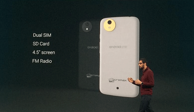
AndroidOne seeks to work with local developers in emerging,underdeveloped markets to form devices catering to the specific needs of that particular niche. The project is set to kick-off in India with three major manufacturers (Micromax, Spice and Karbonn) and Google even demoed a Micromax device with all the final features and a price-tag light on the pocket (which Sundar claimed to have been using personally for “weeks”). The prospects look promising and Google seems to have hit the nail bang and centre on the head here.
2. Prettier Google
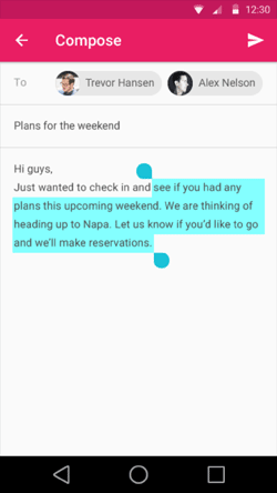
An immense section of the Keynote was devoted to something that Google called “Material Design” and *enter fanboy mode* IT IS AWESOME. Google has literally thought outside-the-box with this one. They have successfully converted our 2D smartphone displays into 3D without any of the added gimmicks within the hardware.
Matias Duarte spoke about how they decided that with the simple addition of a Z-axis to the already present X and Y axes (think in terms of the graph paper from math class) within the OS’ display rendering could add levels to the display essentially tiering your interface in the order the developer wishes for it to be perceived. Material Design also adds API’s within the Android software that will allow it to realistically render shadows and backdrops as any materials moving in real-life would. They showed demo upon demo making this concept apparent and each one rendered results more captivating than the last.
Since the largest part of the event was dedicated to discussing this, you should be surprised there is yet more to be told. Material Design has changed interaction within your multi-tasking screen which now shows multiple cascading windows rather than the 2D above-and-below traditional view on Android. It goes a step further by displaying each of your browser tabs as a separate cascade and Google (as charitable as they are) have opened up this API for usage by developers to whomever it makes sense. Essentially de-classifying apps into sections and increasing the experience of immersion into the OS.
Google went on and on about Material Design but with the above you can rest assured you know more than most of the absentees.
3. Google Evolved
The much awaited release of the new Android OS is presently simply being called the “L” version (contradictory to the rumoured name Lollipop). The system brings with itself a number of “fresh, bold and new” looks as Google phrased it with major updates lying in some specific segments along with deep, system-wide enhancements. See “Prettier Google” above for updates to the basic UI and read-on for a more in-depth description.
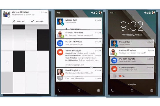 Unlocking your phone is so 2013. Google has merged the notification panel with the lock screen so that all your major alerts, reminders and conversations are available to you from the moment you power on your display. The notifications have been separated into Google Now themed cards which you can access and interact with without ever having to make the effort of entering your pin or pattern locks. Speaking of locking, Google has made Android aware of it’s environment so that it won’t even ask you for your unlock specifications if it decides it’s in a secure environment, for example: it it detects your smart watch within proximity (see “Google on your wrist” below) or if it detects itself connected to your home WiFi system. Google has been known in the past to never ever let innovation come to a standstill and this only goes to show how much they’re willing to do for their users and developers.
Heads up. This is a new form of alert which seeks to minimise disturbance from device usage by displaying your notifications in a separate segment of the screen without ever halting the task-at-hand. Overdue? Yes. Cool? Hell yes.
Beyond Butter. With it’s release of Jellybean, Google brought along Butter which was headed to enhance the performance of the device. Google has now surpassed that benchmark with initiative like Google Volta (which is designed to maximise battery time and minimise unnecessary usage) and improvements on how your device utilises it’s CPU and GPU abilities. Simply stunning how they’re still getting more and more from devices that are already out on the market.
Finally, Android will be getting separate profile handling capabilities to ensure there is a clear-cut boundary between your work and home interfaces while ensuring their still remain the required lines of communication between the two. The “L” version is here to stay and to be the best while it does.
4. Google on your wrist
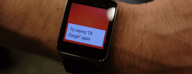
WOW. There were people literally mouthing these words and the Android Wear hardware can up for demonstration. Essentially the equivalent to your phone of what a key is to a lock the Android watch went leaps and bounds beyonds what even the most shrewd of critics expected. AndroidWear is heavily focused of interaction through voice and consistent integration with your smartphone. Apps will not need to be installed separately on the watch and reminders etc. will sync through the system to all your devices once set on this wearable.The features we saw go on and on, but we’ll try and catch them all for you.
GPS, the watch can tell where you are and where you’re going simply by piggybacking on to your smartphone’s GPS abilities essentially making it an always-with-you navigation device plus reminder plus to-do list. You can set location based notifications and you no longer have to be scared of missing them because as soon as your wrist buzzes, all you have to do is look down. Needless to say, the miniature display does not stop the watch from becoming the TomTom of the future.
Google Now, but better. The watch analyses your information and caters the screens it offers to best suit the needs it has evaluated. The example Google demoed was where on of their representatives was travelling to Brazil and the watch showed everything from the departure time of the airplane to the boarding pass QR code to the temperature/weather at their destination, the time at home, the distance to the hotel, the number to call for a cab service, the number of steps taken and much much more that Google intends to continue and add.
Phone calls and Text messages, duh. You can accept or reject phone calls by two swipes from different sides. You can also swipe up and send a message along with the rejected call. But where Google outsmarted us was with a quick swipe downwards from the top, you can mute your watch so it doesn’t disturb you until you repeat the gesture and unmute the device. Not bad, right?
The list goes on and on. They unleashed the SDK’s and API’s so developers can harness their true power beyond where the minds at Google have managed to reach. They showed apps which allowed you to order food, ask for a ride from Lyft and follow recipes all without ever touching your phone. This watch could very well be the smartphone addition that actually decreases our phone usage while increasing productivity to previously unseen bounds.
The three watches Google spoke about specifically at the Keynote were the LG G, the Samsung Gear Live and the Motorola 360. Expected ranges like between $250 and $300 with the LG G already up for sale and the Samsung offering expected in the first week of July.
5. Google in your car
AndroidAuto does what Apple has shown us possible in the past, except maybe with a little bit more G in it. El Goog’s offering is more contextually aware. It will bring up the relevant information at the right time on its own. Light the route you take to work each morning, the music you listen to at different times in the day and so on… It is also, like AndroidWear, heavily focused on voice control in order to make the driving experience safer than ever before. Kudos to your commitment to saving our roads, Google.
They have already partnered up with almost 25 car developers including Honda, Nissan and Ford and the cars are expected to hit the roads within 2014.
6. Google in your living room
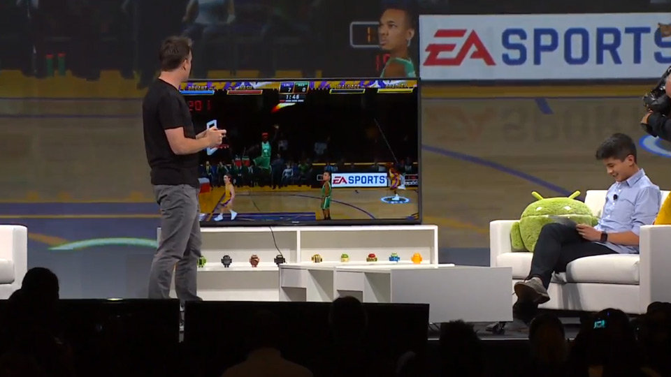
Just when you thought you couldn’t have any more Google in your lives, Google came into your TV as well. Before they spoke of this new frontier, the Google execs made sure they emphasised how this isn’t a new version of the Android OS but simply an extension of it to cater to the 10 ft environment (with 10 feet being the standard distance between TV and TV-watcher). Larger icons offering suggestions, streaming services and even gameplay within a minimalistic approach to displaying only what you need to see. AndroidTV is the definition of forward thinking and Google says that a number of TVs will begin to ship the platform this fall.
Specifics of the OS that were unveiled last night were the fact that it allows for the suggestions to fall on top of your active video playback so your experience does not get interrupted, that you’ll be able to control these devices from your Android phones, tablets, phablets and even your AndroidWear watches. Take a minute to catch your breath, we’re turning into the Jetsons.
7. Healthier Google
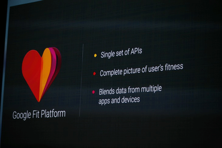
Following Apple’s announcement of HealthKit, Google brings to us GoogleFit which essentially does the same as HealthKit was described to do earlier. Upon your permission, GoogleFit will allow different applications to come together and provide a “unified expression of all of it’s user’s fitness data”.
8. Google Together
With one director now leading both departments, the two platforms are finally beginning to converge to one focal point. There’s the features we’ve seen in the past from other platforms which as the fact that your Chromebooks will unlock when your Android devices are nearby, your text messages and phone calls will display themselves on your laptop screen but then there’s the big one. Your android apps will now run ON your laptops and although the demos displayed to us were very very limited, the possibilities immediately expand themselves creating a new platform for developers to entertain their target market. Google just became more google-y.
With that it comes time to bid adieu to Google for another year until the join us at I/O 2015 but there remains absolutely no question that they’ve left us with more than enough food-for-thought, hand, couch and car to feed our curiosities till that time. As we always say, if you feel we’ve missed anything from the event that you think deserves web-canvas, make sure you mention it in the comments below. Also, if you find yourself confused above some of the specifics we’ve mentioned above, just Google it.
