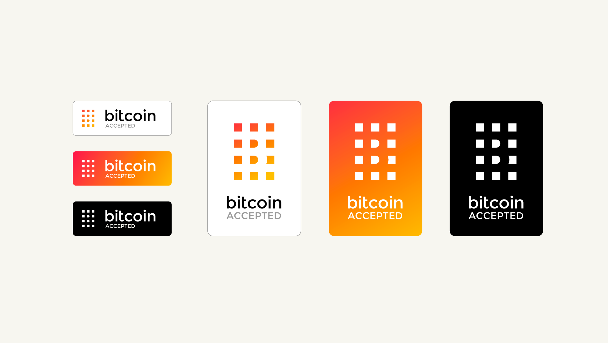
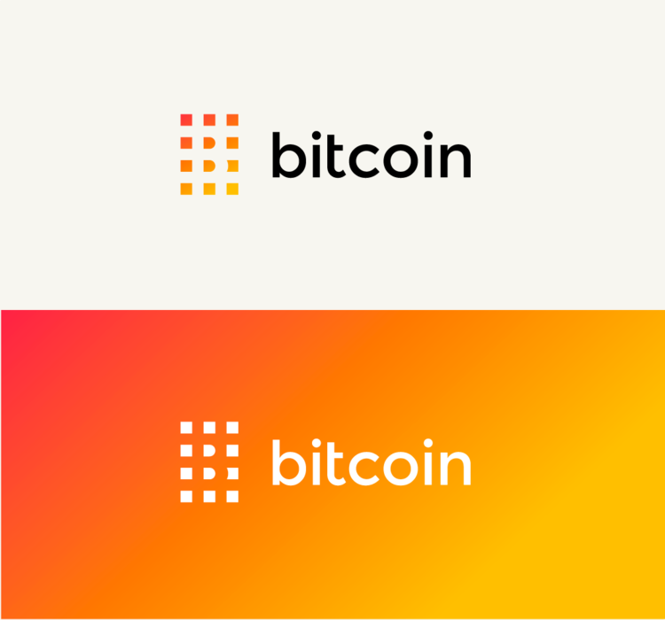
A designer Martin Bekerman from Argentina has visualized a new Bitcoin logo and identity and it looks very neat. Bekerman is passionate about Bitcoin, its future and how it can make lives of people easier. He thinks that the new identity and design is his tribute to the Bitcoin community.
Also Check: How to buy Bitcoin in Pakistan
The design was shared on Reddit and received mainly positive and affirming feedback from enthusiasts.
Before looking at Bitcoin new logo concept, let’s take a look at the current Bitcoin logo.
 The current Bitcoin logo has a lot going on; it is coin-shaped and has a dollar currency mark as well. Bekerman believes that the Bitcoin logo should shackle the FIAT currency footprints from its branding because it is totally different from that.
Also, he seems to be inclined towards making Bitcoin logo flatter and going away from skeuomorphic design concept.
He says,
“The usage of the US dollar symbology and the coin shape have been really helpful in introducing the cryptocurrency to the world, but they keep newcomers from reaching a more profound understanding of what bitcoin really is. I think that a new logo can help us break the analogy with the boring FIAT currency, and also suggest a more direct association with the amazing technology behind Bitcoin.”
On the new identity concept, he said that the new logo is decentralized just like the Bitcoin itself.
“The fact that the logo itself it’s built out of separate units relates to the divisible and decentralized nature of bitcoin.”
Here are some more applications of its logo and its branding on different assets.

What are your thoughts on this new logo, if the community likes it, there are ample chances of its official adoption as well.


