Google Maps, easily the best mapping service available, just got even better. Google has dispatched an update to Google Maps with a whole set of improvements like a cleaner design and updated color scheme while introducing a useful new feature called “areas of interest”.
Areas of Interest
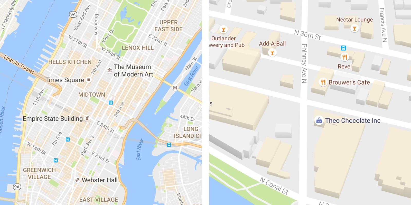
The update brings along a brand new feature called “areas of interest”. Basically, it is a way to indicate large concentrations of public places like restaurants, bars, and shops on the map. These areas are now shaded in orange on Google Maps. You can zoom in further on these shaded areas to see more details about each venue and tap one for more info.
“We determine “areas of interest” with an algorithmic process that allows us to highlight the areas with the highest concentration of restaurants, bars and shops,” said Google in a blog post. “In high-density areas like NYC, we use a human touch to make sure we’re showing the most active areas.”
A cleaner look and balanced color scheme
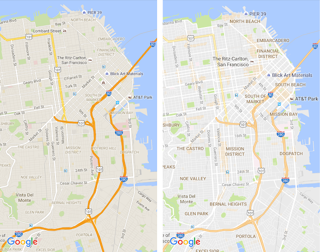
Google Maps is also much cleaner now. While Maps is already pretty intuitively-designed, they have made it even more aesthetically-pleasing by removing all the elements that aren’t essentially required. What they did is that they simply removed road outlines and the result, as you can witness below, is immediately noticeable.

They have even made modifications to the color scheme, making it much easier to quickly identify places like hospitals, schools or highways.
The changes have been rolled out to Google Maps’ mobile apps as well as for desktop users.


