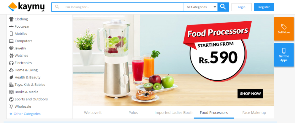
Hot on the heels of HomeShopping’s design revamp, Kaymu has also unveiled a rebranding of their online shopping portal.
Navigate to Kaymu.pk and you’ll find a noticeably different website than the one a few days ago. The website has undergone a major revamp and everything has been uncluttered, presenting a cleaner and an enhanced user-friendly interface. The whole design is much more minimalistic and it just feels modern and well thought out, leading to a much better browsing experience through the shopping portal’s products.
Apart from the face lift, the website has also been minutely improved in a number of key areas, like the number of clicks in the checkouts process have been reduced and there is a more personalized approach, allowing users to simple like products to are automatically add them to their wishlists. They can also follow their favorite sellers, chat with the sellers directly as visible on the website, rate them and even give a direct opinion on products.
Kaymu.pk is a popular choice for consumers around Pakistan to sell their products through a unified portal. The company itself is a part of the German Startup Studio, Rocket Internet, which is also responsible for other popular international startups functioning in Pakistan like Carmudi, Lamudi, Jovago and foodpanda.


