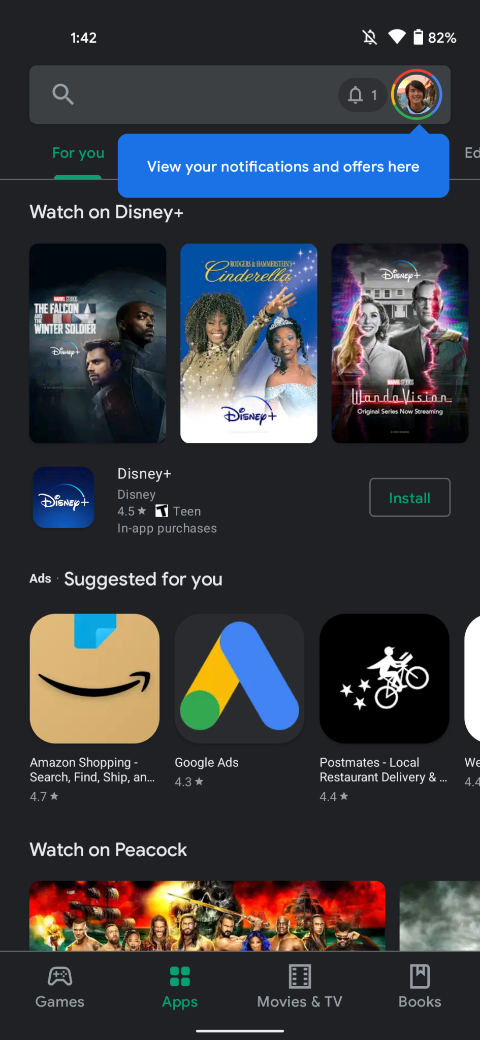
With Google’s Play Store receiving a fresh new redesign based on the ‘Material’ theme, followed by a dark more, later on, the company has taken further steps to improve Play Store by giving it a new navigation method as well as revamped settings.
Once the new updates are rolled out, a blue overlay appears to highlight your profile avatar in the top-right corner. Your current account is listed at the top with others hidden until you tap to expand. Below that, Google lists your Play Points status with a progress bar.
Though it is to be noted that the ‘My apps & games’ page is still the same but the ‘Library’ is new and links to Wishlist, Google TV/Play Movies & TV, and Play Books. The ‘Payments & subscriptions’ is now confined to a single page, with ‘Play Protect’ next. ‘Notifications & offers,’ as well as ‘Play Pass,’ has been moved down compared to previous navigation drawer placement. However, an alerts count will briefly appear in the search bar when you first open the app. Settings and Help & feedback round out the list.
Although the Settings menu has been revamped, it’s still technically one long list where the four main sections are hidden by default, and everything has been centralized into four categories as follows:
- General: Account, auto-update, preferences
- User Controls: Fingerprint, purchase authentication
- Family: Parental control, parent guide
- About: Play Store, build version, device certification
Limited users have had access to this new version of the Play Store but as of now, Google is now rolling the new version to all Android users globally.


