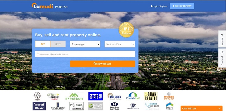
Design thinking is a significant aspect for any startup in order to design a better product while keeping their target end users in mind. Startups can imagine better products if they can empathize with their users and revamp their products to fulfil the needs of the end users. This is why Lamudi.pk, a global property portal, has re-launched their website to offer a more intuitive design that streamlines the online house-hunting process for users around the world.
The website has been updated to a more responsive layout which can adapt to match the user’s particular device and screen size. The platform’s appearance has been improved to display properties for sale and rent in an easier-to-read format with larger photos. Moreover, real state agencies and advertisements have dedicated sections and spaces on the websites.
On the launch of the new website, Lamudi.pk’s, Country Director, Saad Arshed, said:
“This redesign puts the user at the center of our product. The responsive design is very important because we know an increasing number of our users access Lamudi on a mobile device in addition to a desktop PC. The new design is tailored to our customers’ needs, making it easier than ever before to find the perfect property online and to contact real estate agents via phone, SMS or email. At the same time, we will be introducing a variety of new features to cater for our partners, particularly agents and brokers. This is why we have introduced dedicated sections to showcase real estate agencies and created more space for listings, photos and advertisements.”
The homepage of Lamudi.pk has brighter, cleaner design in engaging new colors where search results are easier to read. The new two-column design has allowed more space to display properties and promote featured agents. A new price slider has been added to search filters on both web and mobile application which will let users filter results by price and property size along with other relevant features.
If we talk about the property listings, then they now have a cleaner structure, with larger images and intuitive navigation elements introduced. All other elements of the site – including the My Account section and Listing Uploader – have been given a fresh new layout and updated to the new colors, with many further usability improvements following soon.
If you have tried Lamudi.pk, share your experience with us in the comment section below.


