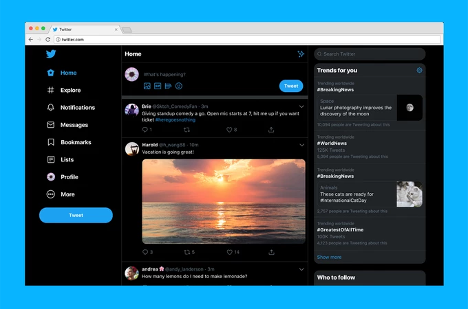
Twitter’s website is going to get a redesign soon which will make it similar to the mobile app. The new interface will change the layout of the website as you can see in the picture below from TechCrunch. On the left, you can see all the major tabs which used to be on the top. On the right, we have the trending sidebar which is now much more detailed than before. Frankly, even the dark mode looks more like the actual dark mode which users needed, with a complete black layout rather than the dark blue finish on the current version.
In regards to functionality, there is not much change. The redesign is largely focused on unifying the design of desktop and mobile versions of Twitter. There is a bookmarks tab now on the homepage and for those who don’t know, Bookmarks allow you to privately save tweets on your profile if you want to see them later on.
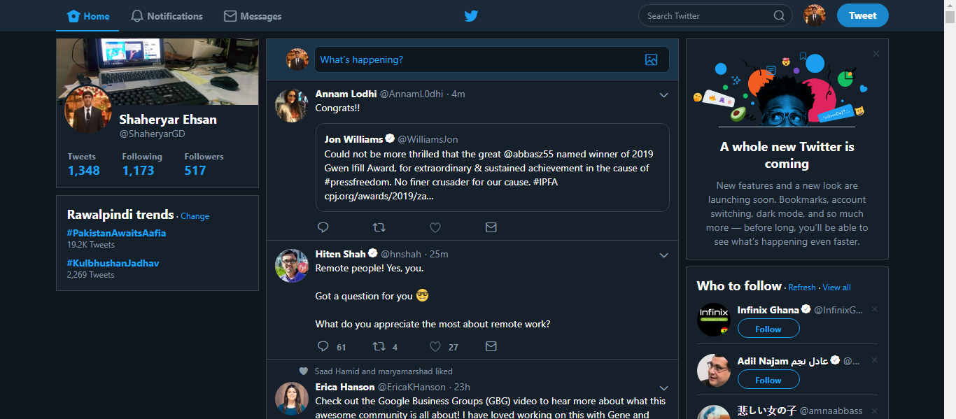
This is how Twitter looks currently:
And here is the redesigned version:
Another thing you should note that “Moments” has been shifted down into the more category on the left navigation panel. Plus if you have multiple accounts, you will be able to switch between them easily on the new interface.
Also if you don’t like the all-black look, Twitter will be announcing different theme options and you can select the one that suits you best.
The updated look will start rolling out globally and will be available soon to all users.


