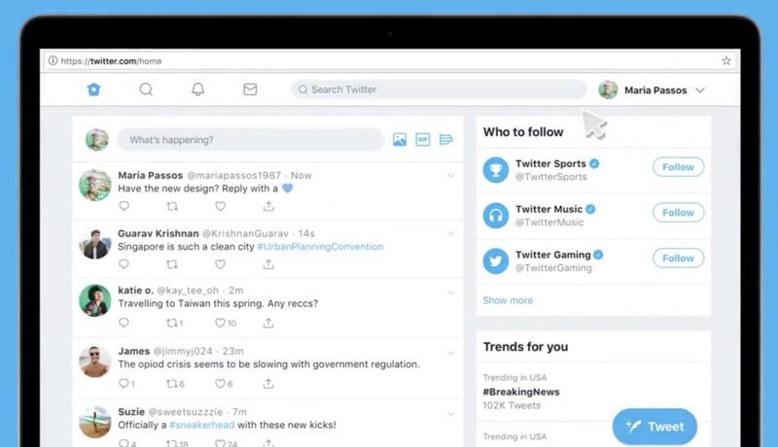
In an attempt to improve the experience for desktop users, Twitter has started rolling out a previously teased web redesign for some of its users. The new web interface comes with numerous new and exciting features coupled with a much simpler two-column layout.
For now, only a few web users have the option to try out the exciting interface and they are asked to share their feedback before it begins to roll out to everyone.
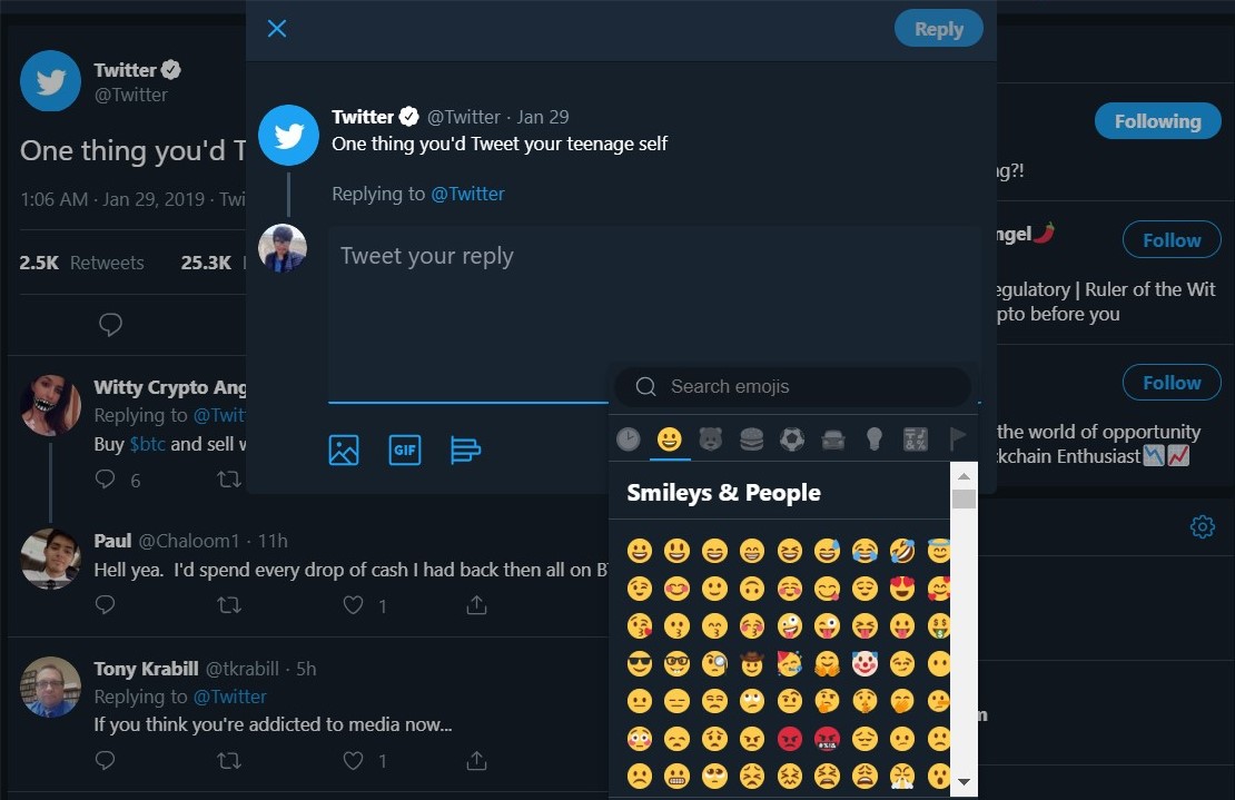
The new web layout for the social media giant includes a dedicated emoji button in the tweet box, which makes it easier for users to describe their feelings without using words. There is also an updated trending section that appears on the right-hand side of the page and keeps you updated with the Tweeter buzz. Also, the little aesthetic updates make it easier to see who’s involved in a conversation. All these changes have allowed the web interface to be condensed from three columns into two, making it easier to read and send tweets.
This update doesn’t include the previously announced updates like status updates, edit button, and reply functionality, which might still be in internal testing and are expected to come to more users in the coming weeks. Twitter is still working on an advanced dark mode and promises its users that it’s going to roll out soon to help save battery life and reduce eyestrain while browsing the micro-blogging site.


