The Windows 10 Mail application is making some improvements to its interface, which means bringing a new dark mode and easier account switching. The changes are currently in testing with Fast ring Insiders, with a few handy tweaks being added to how the Mail application is used, reports Neowin.

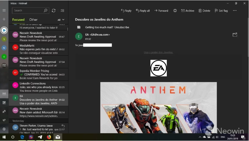
Microsoft has been working on an improved design for the sidebar for quite some time now and the latest improvements to the left sidebar of Mail app allows you to switch between different email accounts without expanding the hamburger menu. The left sidebar now lists all accounts with circular icons even while the menu is collapsed, to make the switching between accounts a lot easier.
The update also brings changes for the message portion of the mails. Mail will now honor the Windows theme settings in the message portion of emails. The system-wide mode (dark or light) will now decide the background for messages accordingly. For example, if you have the light mode enabled system-wide, the backgrounds for messages will now be light as well, and vice versa for the dark mode.
In addition, Microsoft is also making it easier to toggle between the light and dark themes. A toggle button will sit alongside other actions in each message, that will let one switch between the themes with just a click.
Currently, the update is rolling out to Insiders in the Fast ring or Skip Ahead only, as we wait for the general public release. However, we expect the update to roll out to everyone alongside the release of Windows 10’s next major feature update, currently codenamed 19H1.


